music art film review - REDEFINE magazine
2012 Album Covers of the Year
Inside this feature are 98 album covers spanning a wide array of sonic and visual styles, each selected for its own unique contribution to the world. They are not ranked; instead, they are broken down into sections based on conceptual underpinnings or artistic mediums, and then are displayed on spectrums.
Get started by navigating into any of these six sections:
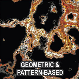
Geometric & Pattern-Based
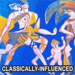
Classically-Influenced
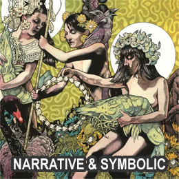
Narrative & Symbolic
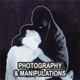
Photography & Manipulations
Painting & Illustration
College, Sculpture & Mixed Media
Painting & Illustration
You can also see last year’s at 2011 Year-End Respect For Album Cover Art
[nextpage title="Geometric & Pattern-Based (22)"]


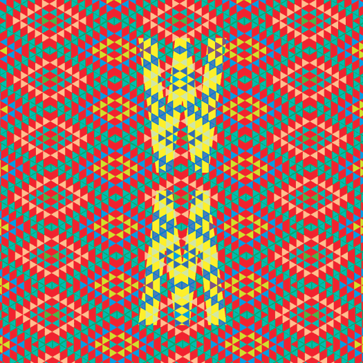

COMPLEX || PATTERN-BASED
Ancestors – In Dreams And Time // AU – Both Lights // Believers – Self-Titled // Ben Vida – Esstends-Esstends-Esstends // Cloudkicker – Fade // DVA – The Fly Juice // Goat – World Music // Hecker – Chimerization // Ital – Hive Mind // Laurie Spiegel – Expanding Universe // A Lull – Meat Mountain EP // Magic Touch x Sapphire Slows – Just Wanna Feel // Man Forever – Pansophical-Cataract // Mike Shiflet – Merciless // Olafur Arnalds & Nils Frahm – Stare // Pangaea – Release // Peace – Delicious // Stephan Mathieu & Sylvain Chauveau – Palimpsest // Swahili – Swahili // Vessel – Order Of Noise // Wild Nothing – Nocturne // The xx – coexist
![]()
ALL CATEGORIES:
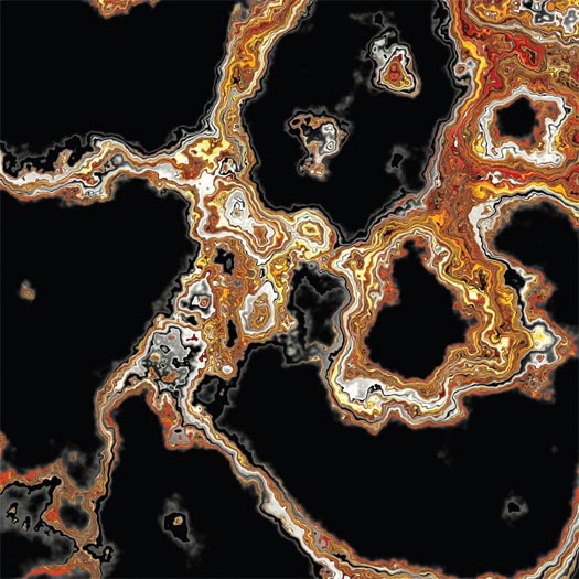
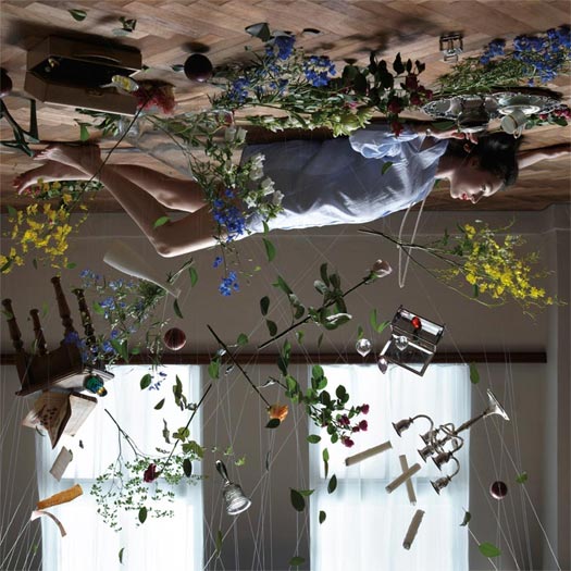
Artist unknown.
“Crazy lace agate is between 65 and 90 million years old!” – Adam Heathcott of Hometapes
RELATED POSTS:

ARTWORK & DESIGN BY HOMETAPES – home-tapes.com
CONCEPTUAL HELP FROM SHAWN BRACKBILL – shawnbrackbill.com – AND SADEK BAZARAA – sadekbazaraa.com
“Sara (from Hometapes) and I both collected rocks as kids. Thirty plus years in, we’re still looking down. In the past year, we come across a few slices of Mexican crazy lace agate. They appeared to have entire solar systems living within them. I threw them on a scanner and upped the resolution as high as my computer would allow, then spent time viewing them at high magnification uncovering more textures and shapes. (Fast forward through huge amounts of color adjustment to make them look as close as possible to the real thing.) What you end up with are two sections (front and back cover) of the agate that were originally not much larger than a penny. Up close, you can just live in them. We knew we wanted to take a chance with the print production and decided to print the images on top of foil board. This added more dimension to the agate, and creates an interactive experience for the person holding the record as their reflection becomes part of the cover. Looking out. Looking in.” – Adam Heathcott of Hometapes
PROCESS & COLLABORATION
“From what I can remember, it was definitely a back and forth process that found us going through several ideas. I would send over words and abstract thoughts on where I was coming from with the music/album, and [Adam and Sara would] find interesting visual representations of some the things I was expressing. Both of them are quite brilliant at creating rather magical artwork/packaging for all of their releases. Definitely worth going back and looking through their entire catalog.” – Luke Wyland of AU
COLLAGE BY WESLEY POWELL OF BELIEVERS
LAYOUT & WEBSITE BY TYLER POWELL
PRINTING BY ALEX DURLAK OF STANDARD FORM – standardform.org
“I tend to become overwhelmed by the infinities that open up when working in any medium, be it musical, visual, linguistic, or otherwise; it’s difficult for me to move forward and make a choice knowing that any choice I make is ultimately arbitrary…
I’m crippled by open-endedness, so in order to maintain a level of sanity and allow myself to complete anything, I try to limit the choices I’m able to make. As the rule for the collages on/in our record, I limited the source material to just one book or one photograph within said book. Working with fractions of an image teaches me to see and appreciate the unnoticed [things] I wouldn’t in a more passive viewing. Textures. Geometries. Absences. Whatever. For me, it’s a meditative process and I like to extend that kind of vision/perception beyond my time holding a Stanley and scissors.” – Wesley Powell of Believers
DESIGN BY BILL KOULIGAS & KATHRYN POLITIS
Artist could not be reached for comment.
ART DIRECTION & DESIGN BY CHARLIE WAGERS FOR THREE BEARS DESIGN – charliewagers.com
“The title, Fade, is a reference to how memories work and how that ties into nostalgia. Ben was hugely inspired by this Alan Watts quote:
‘There is evidence around — monumental evidence — of a past, of vibrations which have been evoked before, of age-old hills and ancient buildings. Yet these very remains and memories are being reiterated and structured from the vibrations in the present.’
Basically meaning that the past isn’t really the past because it’s still resonating in the present. All of our ideas of what the past was like still come out of artifacts or ideas that we construct in the present, so it’s not really the past at all. With that, I wanted to create this crazy abstract image, that partially represents the dynamics of the audio itself, but also those vibrations, and the encompassing cycle of the past resonating to the present.
[The] Alan Watts quote was originally going to be typed into the album artwork. But Ben ended up scrapping that idea because he encoded the text into audio, which he then hid in the digital download version of the record. That way some listeners would recognize the way it was encrypted, and then they could translate it back to the text. Pretty cool, huh?” – Charlie Wagers
DESIGN BY OPTIGRAM – optigram.net
Artist could not be reached for comment.
DESIGN BY CHRIS REEDER OF ROCKET RECORDINGS
THEMATIC ELEMENTS
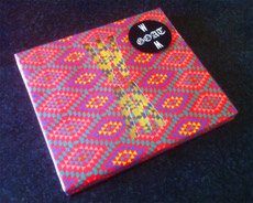
“The idea I had in my head was to use an African pattern [and] make it psychedelic, but also contemporary and modern as well. First, I hunted out some patterns in bookshops and online, found one I liked, and copied it. Then I tried lots of different colourways, as wanted it to have a bright, in-your-face but modern feel. Then I was playing with the album title and the ‘WM’ motif just happened… The idea of the die-cut and contrasting the coloured patterns came from the exploration with a sleeve that messed with the eyes!!” – Chris Reeder
PROCESS & COLLABORATION
[The] album sleeve was born out of circumstance. We had commissioned two ‘already existing’ photos to be used on the front and back of the sleeve. Then a week before we were sending the record to manufacture, the photographer called us and said they had changed their mind and we couldn’t use them!! At the time, we were really disappointed by this — but in hindsight, it was an absolute blessing as the sleeve we ended up with (which we had five days to come up with, design, artwork, and get to the printer) is so much better and unique than the photos we were gonna use.
At first, I thought it would be too expensive to make but our amazing manufacturers, Breed, were able to find a way of doing it within our budget, and we are so chuffed we did as the die-cut sleeve looks amazing on the record racks in shops. By all accounts, it has become a bit of an iconic sleeve already!!” – Chris Reeder
DESIGN BY NORM – norm.to
“For ‘Chimerization’ Hecker invited the Iranian writer and philosopher Reza Negarestani, to contribute an experimental libretto, ‘The Snake, the Goat and the Ladder (A board game for playing chimera)’ a script that has been recited by a group of speakers and recorded by Hecker in anechoic and sound-attenuated chambers – rooms designed to minimize the reflections of either sound or electromagnetic waves.
Hecker characterizes ‘Chimerization’ as a concept derived from psychoacoustic investigations on difficult-to-define areas between language and non-language, a process focusing on the decomposition of sound and synthesizing incompatible modalities, surpassing their respective particularities without fusing them, in order to obtain a narration beyond immediate comprehension, which may be deciphered through repeated, ‘active’ listening.
‘Chimerization’ is released in the following languages – English (eMEGO 153), German (eMEGO 154), the mother tongue of the artist and Farsi (eMEGO 155), the orginal language of the writer.” – Editions Mego


ARTWORK & DESIGN BY SAM CHIRNSIDE – samchirnside.com
Artist could not be reached for comment.
CONCEPT AND DESIGN BY LAURIE SPIEGEL
ADDITIONAL DESIGN AND LAYOUT BY TOM MCCUTCHON AND UNKNOWN
THEMATIC ELEMENTS
“First I should mention that the CD album cover was based on the 1980 LP cover, so I’ll be talking mainly about that… I love color and texture. I wrote the notes on my Apple II, and it had a Imagewriter I dot matrix. In 1980, printing shops didn’t have any way yet to accept and print from computer data or to print digital images. So I had the idea of creating a texture with the dot matrix printout that could be superimposed (actually masked out of) straight color fields. For the text, I interviewed myself, keeping in mind the kinds of comments and questions my then-quite-unusual music so often elicited, and I wrote enough to be able to fill up both sides of the LP jacket with texture.” – Laurie Spiegel
PROCESS & COLLABORATION
“For the recent CD and LP release, Tommy did a wonderful job of recreating the original design, and also of keeping me in the design loop. We worked closely together in doing the CD design, because it included various elements not present in the original LP album. On-disk printing, the tray card, the 24-page booklet, the UPC sticker — these were all additions Tommy made to the LP design he was recreating, and we coordinated our preferences and thoughts with each other closely on each of those, sending feedback and files back and forth quite a number of times.” – Laurie Spiegel
THE EXTRAS
“They said there was budget for only “1 color”, but in fact that meant only 1 pass of the press. I very much wanted full color, to reflect the aesthetic of the music, to capture a sense of the music. So I suggested, and the printer agreed to do, a split fountain of cyan, magenta and yellow. The colors were all a bit on the darkish side to make the white “print” readable, it having not been print at all but just absence of ink (to avoid another printing pass).
In the original LP edition, as the print run ran through, with the inks in the 3 areas of the trough mixing and blending more and more from the start to the finish of the edition, the colors blended more broadly. At the start of the press run, the 3 areas of color were relatively distinct, but by the end of the run, they were considerably mixed. So, although the jackets looked roughly the same, each was, to some slightly degree, unique. This continual variation of color blending was not duplicated in the re-issue, for obvious reasons.” – Laurie Spiegel
SCAN & DESIGN BY NIGEL EVAN DENIS OF A LULL – nigelevandennis.com + electricheat.org
THEMATIC ELEMENTS
“We had come up with the idea for the album a bit from an inside joke. It was something said a couple years ago and when we started writing for the EP it was a bit of a working title that stuck. I think the album cover is much more interesting than the concept. I bought a chuck-eye steak and threw it on the scanner. That’s about it. Ha. Everything ended up digital of course, but it is literally the most raw medium I’ve worked with.” – Nigel Evan Dennis of A Lull
PROCESS & COLLABORATION
“Being an artist and a musician is like a dream come true. The creative process remains completely internal and completely interactive almost as much so as recording the music. The fun part about this band is that when i’m developing the art, i don’t consider my personal style or commercial portfolio. It makes every piece of art I do for the band almost always and entirely conceptual and experimental. It’s another extension of my art and I think it’s a totally fulfilling outlet. We collaborated on the back cover with Chicago artist Bill Connors for some wild illustration. He is a great artist and when I was starting to think about the back cover, it just felt right to show one of his pieces. Really great stuff.” – Nigel Evan Dennis of A Lull
DESIGN & ARTWORK BY BOBBY HOULIHAN – bobbyhoulihan.com
THEMATIC ELEMENTS
“Sapphire Slows released an album a while ago on Not Not Fun, and it was that record sleeve which served as my main inspiration. [Label owners] Amanda [Brown] and Britt [Brown] designed that sleeve using English and Japanese text, and I thought that was a good idea. The record is a collaboration, so the visual concept was to take the title Just Wanna Feel and create a block of text on both the front and the back that was composed of a roughly 50/50 ratio of English and Japanese. The only way to get this ratio somewhat balanced was to translate the Japanese phonetically. Had we done a more literal translation, the Japanese characters would have outweighed their English counterparts, and it would have been really wonky, which the record is not. The tracks are really clean and balanced. Very clear. Very positive. Nothing too complicated. I hope that is reflected in the art. I think it is.” – Bobby Houlihan
PROCESS & COLLABORATION
“Damon was cool with my idea of the text right away. He would send my work over to Kinuko in Japan,and she would okay the translations and make any corrections. She was very helpful in that regard.” – Bobby Houlihan
DESIGN BY DAN SCHECHTER – danschechter.com
THEMATIC ELEMENTS
“The album is an exploration of the sounds created by overlapping rhythms. The core of the performance is two drummers playing drum rolls simultaneously on a single drum. What results is a drone molded by the rhythms coming in and out of phase. It has the effect of creating sounds within sounds. I wanted to capture that unexpected sensation and reference some of that logic. I also wanted to build on the moon theme that has featured prominently in several Man Forever designs. The moon cube on the cover references both this structural process as well as the simple sensation of something so recognizable, distorted.” – Dan Schechter
“I just sent the record to Dan and asked him to come up with something cool. I think I told him I wanted it to really pop and be different from the typical cover… that’s it.” – John Colpitts of Man Forever
THE EXTRAS
“The type on the back cover is comprised of every weight of the typeface DIN overlaid atop one another. ‘Din’ has several meanings. A word meaning “awkward sound or racket” for us English speakers, it’s also a common Arabic term for faith, or more specifically, the way you live your life through faith. For Germans, it’s an acronym for their national board of standards and shorthand for the famous type endorsed by that board for their license plates. If you put all that together, we think it’s an apt metaphor for this project. The visual effect of superimposing the various weights is reminiscent of the overlapping rhythms in the music.” – Dan Schechter
PHOTOGRAPHY BY MIKE SHIFLET – michaelshiflet.com
ART DIRECTION BY JOHN TWELLS OF TYPE RECORDS – typerecords.com
THEMATIC ELEMENTS
“The album is the second in a series focused on the idea of the world as a machine, indifferent to humanity (see Hurricane Sandy for a recent example), and our attempts to exist within such a structure. The palm photos attempted to address several subplots in that narrative. Primarily the difference between how we see ourselves inside the construct of a world we’ve created and our actual existence.” – Mike Shiftlet
PROCESS & COLLABORATION
“I took the photos myself, but I took some outside direction as the photographer. John Twells from the label (Type Records) offered a lot of great advice after I presented my original ideas to him.” – Mike Shiftlet
AUDIO-VISUAL COMPONENTS
“I’ve been using videos in live performances for the past few years. The images are similar to those on the Merciless and Sufferers covers, with a lot of macro photography involved.” – Mike Shiftlet
DESIGN BY TORSTEN POSSELT OF FELD – feld.is
THEMATIC ELEMENTS
“The dot in the middle is actually a famous optical illusion. Stare at it long enough and you will figure it out — hence the title.” – Ólafur Arnalds
“The wonderful thing about working with Torsten Posselt on artwork is that you just give him the title, and he [can] just come up with an idea like this.” – Nils Frahm
“Listening to the release for the first time, I found myself staring at a little dark spot on the opposite wall. The longer I stared, the more surreal the spot became; it seemed to grow a halo, even if I knew that this was just my mind playing a little trick on me. So I started looking into some collections of probes into the moment-by-moment workings of our brain, trying to understand this phenomenon. At any given time, the brain is collecting, filtering, and analyzing information and, in response, performing countless intricate processes, some of which are automatic, some voluntary, some conscious, and some unconscious. The designed artwork functions as such a mind hack. By staring at the radial gradient, your mind tells you that it grows a brighter halo around it even though it is not there.” – Torsten Posselt
PROCESS & COLLABORATION
“It is truly a great pleasure to work together with Nils [Frahm] and Ólafur [Arnalds], and I think we complement each other in a really nice way. When I approached Nils with the idea and some test prints, he instantly felt in love with it, and we spent some hours just staring at the little dark spot in the center of the gradient. I highly recommend doing that as well if you happen to have a physical copy of the release.
During the production we ended up staring at dozens of test prints of various gradient sizes, just like wolves staring at the moon.” – Torsten Posselt
AUDIO-VISUAL COMPONENTS
“I think Ólafur and I are very picky about visual aspects. We also work with light and stage designs, seeing that it [all] adds to the overall experience. If we could manipulate even the smell of our music, I am sure we would even design that. This is what control freaks tend to do.” – Nils Frahm
Artist unknown.
DESIGN BY SAM COLDY STUDIO – samcoldy.com
PHOTOGRAPHY BY ELLIS SCOTT – ellis-scott.com
Artist could not be reached for comment. Alternate version created by Coldy which was not used:

DESIGN BY CARO MIKALEF FOR CABINA – espaciocabina.com.ar
“The two stones, as the lovers, also resembled to me a heart shape when I was composing them, in the funny random way images inspire meanings. But all these meanings were [the] essence of the design choices with no intention to become literal; there was no need [for] everybody [to] understand them in a linear way.” – Caro Mikalef
PROCESS & COLLABORATION
“We work very closely with Stephan [Mathieau, and it] was important for me to receive his input regarding the album, have a platform of thoughts about the direction he wanted to give to the album and to his label Schwebung, and also to try to interpret his ways of conceiving the visual, aesthetic, etc. He is very active and creative regarding the design of his covers, and his mind is full of interesting visual ideas to be explored. The first instances of a design process were very open; we took them as visual thinking tanks that opened visual directions we both wanted to explore. Then with the chosen options, the design process got more and more fitting to specific expectations and needs. Feedback for me can be as interesting as exhausting sometimes; you realize how arbitrary things can be regarding the visual perception and you test the reception by others. I also had the feedback of my studio partner in Cabina, Coni, which is a valuable reference to me in graphic terms, but mainly what I need to point out is that the design process was very open and mediated by testing several instances and [was] not only my personal isolated work. We both had an interesting dialectic until we got to the final cover.” – Caro Mikalef
AUDIO-VISUAL COMPONENTS
“In general, I don’t use live visuals for my shows; ideally, they are performed on a great sound system in a pitch dark space. I’m using visual aspects in my installation work though, i.e. 16mm projection. Caro and I also built a large kinetic object made from optical lenses, filters and mirrors for a project.” – Stephan Mathieu
ARTWORK BY XUA OF SWAHILI – www.facebook.com/XUAsound
THE EXTRAS
“The piece was actually around for almost two years as we recorded and re-recorded the record. It was never intended to be the cover, but as we approached finishing the album, it became clear that this piece was closely tied to the material the whole time. I believe the original basis of the cover is a Christmas album of hymns featuring George Beverly Shea.” – XUA of Swahili
Artist unknown.
PHOTOGRAPHY BY SHAWN BRACKBILL – shawnbrackbill.com
LAYOUT BY RYAN MCCARDLE – ryanmccardle.com
“Jack Tatum (Wild Nothing) and I worked hand in hand on this release from the get-go. We went through various stages, starting with collage then going to photography until eventually ending up with this marbled paper idea. We liked what these marbled papers provoked emotionally. I like to think it represented a somewhat “nostalgia in motion.” The die-cut packaging, coupled with the multiple marbled papers, gives the listener a choice of what their cover will be. My hope was that they could place a visual connection with their audible experiences, especially since everyone will pull their own meanings and personal connections from Nocturne.” – Ryan McCardle


THE ALBUM COVER FOR THE XX’S 2009 RELEASE, XX
ARTWORK BY THE XX
[nextpage title="Classically-Influenced (13)"]

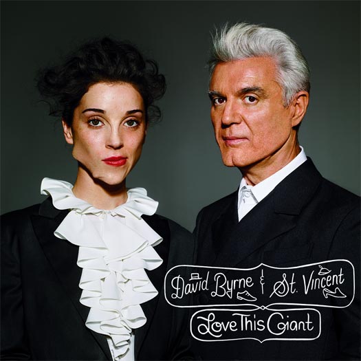
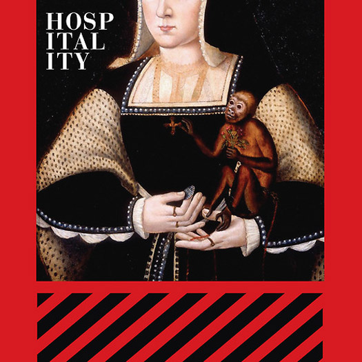
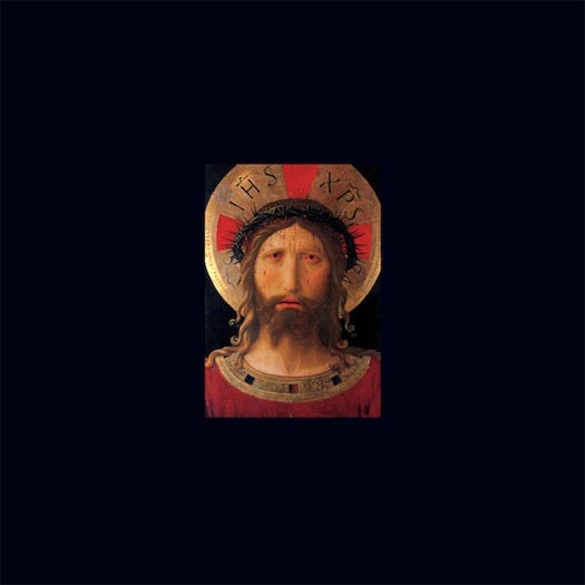


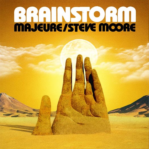

Aaradhna – Treble & Reverb // Best Coast – The Only Place // Black To Comm – Earth // David Byrne & St. Vincent – Love // Debruit – From The Horizon // Horrid Red – Celestial Joy // Hospitality – The Drift / Monkey // Om – Advaitic Songs // Para One – Passion // Peaking Lights – Lucifer // Steve Moore & Majeure – Brainstorm // Will Stratton – Post Empire // Xiu Xiu – The Air Force
![]()
ALL CATEGORIES:

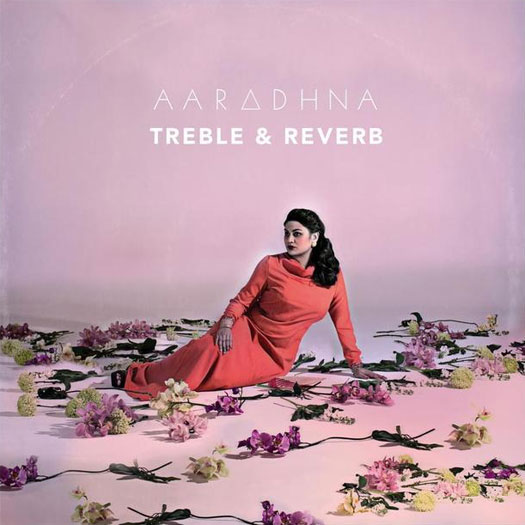
ART DIRECTION & DESIGN BY SPECIAL PROBLEMS – specialproblems.com
PHOTOGRAPHY BY TROY GOODALL
“I really wanted a bold powerful portrait of Aaradhna to be on the cover. I love the matter of fact cover portraits of artists like John Cale, Bob Dylan and Alice Coltrane. Alice Coltrane’s Journey in Satchidananda is a favourite for me. So I guess we were trying to do a modern take on that. A classic portrait of the singer/artist. Aaradhna has a beauty and power as a person and singer that we thought shouldn’t be ignored. We played around with a bit of hand-tinting parts of the photo afterwards, it helped push the photo into something a little more painterly.
For the typography and other vector patterns that appear throughout that album packaging, I wanted it to look like the kind of patterns you’d see on a Morton Subotnik record or [that of] some other early Electronic music pioneer. These were touch points in our thinking — elements to consider without falling into a recreation or something pastiche. It’s a modern take on something classic, like the album itself. You could maybe go as far as saying the warmth and organic nature of the photography contrasted against the hard vector shapes is our Treble & Reverb. The cover was about creating a new look for Aaradhna — one that was equally her and her personality but a side of her that her audience hadn’t seen before.” – Joel Kefali of Special Problems
ART DIRECTION & DESIGN BY DAN SCHECHTER – danschechter.com
IN-STUDIO PHOTOGRAPHY BY DAVID BLACK
LANDSCAPE ILLUSTRATION BY JESS ROTTER
BOOKLET LIVE PHOTOGRAPHY BY PETER DOVGAN
BOOKLET 3D PHOTOGRAPHY BY ALEX MARKS
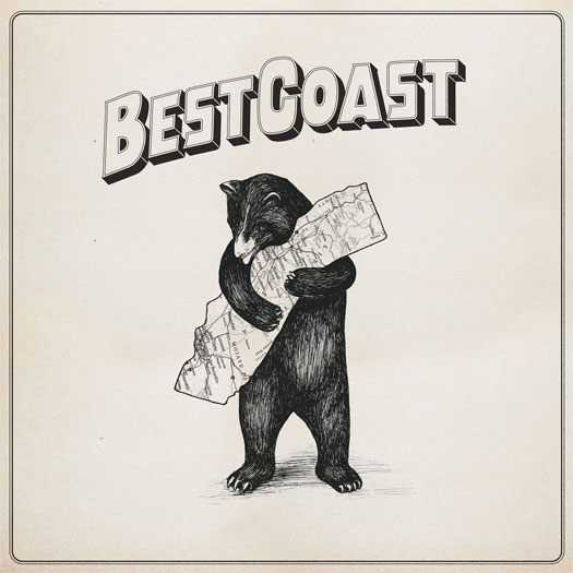
“Obviously, Best Coast is all about California. Everything from their name to their sound is influenced by the state. This album is no exception. The state is a backdrop behind all of the songs. Sometimes it’s a character. Sometimes it’s an ideal. Other times it’s a sweet and safe hiding place.
We wanted the album designs to capture this love for California… I found the illustration on the cover of a 1913 songbook for the state song of California, “I Love you California.” Even though the bear is the state animal of California, I was pretty surprised when I first saw it. The humor and sweetness of illustration seemed ahead of its time. I knew we had to include it somewhere on the album. Initially, it was on the back cover as a smaller illustration. Everybody was so drawn to it, though, that we eventually decided it would be perfect as the centerpiece of the cover. We redrew the bear and updated some details of the state. We wanted it to feel a bit more evocative of the golden age of California and [to] fit more in line with the bands previous artwork. It’s half-mascot, half-protector, and (humbly), kind of perfect.” – Dan Schechter
PROCESS & COLLABORATION
“The design was really a collaboration between Jess Rotter and myself. Jess works at the band’s label Mexican Summer, but is also a close friend of the band. [She's an] incredible artist and illustrator in her own right[, and] we worked pretty closely on the concepts. She added an illustration of Highway 101 to the back cover and LP sleeve, and coordinated the photography for the back cover and the booklet included in the first run of LPs.” – Dan Schechter
LAYOUT & DESIGN BY MARC RICHTER OF BLACK TO COMM
FILM STILL FROM HO TZU NYEN
THEMATIC ELEMENTS
“The Earth album contains studio versions of a live soundtrack we did for Singapore artist Ho Tzu Nyen’s film of the same name, so obviously we used images from the film for the album artwork. All the conceptual ideas had been realized musically (or in Nyen’s case, in the making of the film); doing the sleeve artwork was kind of a no-brainer. We were considering doing (fake) painted versions of the stills, but it wasn’t really necessary, since the whole film already looks like a huge classical painting.” – Marc Richter of Black To Comm
“This was a film still from a 42-minute film called EARTH, which I made. The film can be described as three continuous long takes that move in and out of a tableau vivant of 50 actors oscillating between sleep and consciousness. This particular film still that Black to Comm chose for the cover reveals the entire set — which is the site of an unknown catastrophe. In the next minute or so, golden light will permeate the scene and all 50 actors will come alive, and stare straight out at us. EARTH is my attempt to work through my obsession with the light and compositions of painters such as Caravaggio, Rembrandt, Girodet and Géricault.” – Ho Tzu Nyen
THE EXTRAS
“The layout was then done by myself, partly inspired by the origin of the name of the De Stijl record label where the LP and CD has been released, so the lettering is very much influenced by the original De Stijl magazine from the 1920s… We only had very low resolution stills at hand that you wouldn’t normally use, but the fuzziness actually added to the mysterious quality of the images.” – Marc Richter of Black To Comm
The album cover is a play on Beauty and the Beast, and a strangely appropriate interview with The Daily Beast reveals more:
ARTWORK BY MARKUS HOFKO RAINBOW MONKEY – rainbowmonkey.de
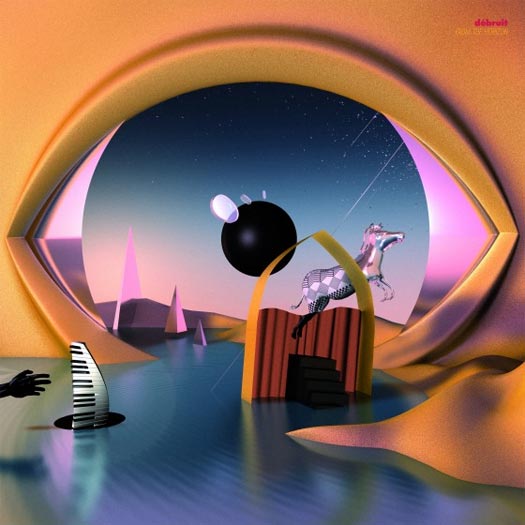
“In the first place, it was just about creating a surreal landscape which would relate to the abstract elements of [Debruit's] three preceding EP covers. Débruit asked for some sort of African influence in the design since his album is strongly based around West African music. The idea to do a homage to [Rene] Magritte’s The False Mirror came later in the process and locked the image concept in.” – Markus Hofko

RENE MAGRITTE – THE FALSE MIRROR
THE EXTRAS
“The first press of the vinyl version included golden records, which added to the already spectacular make up.” – Markus Hofko
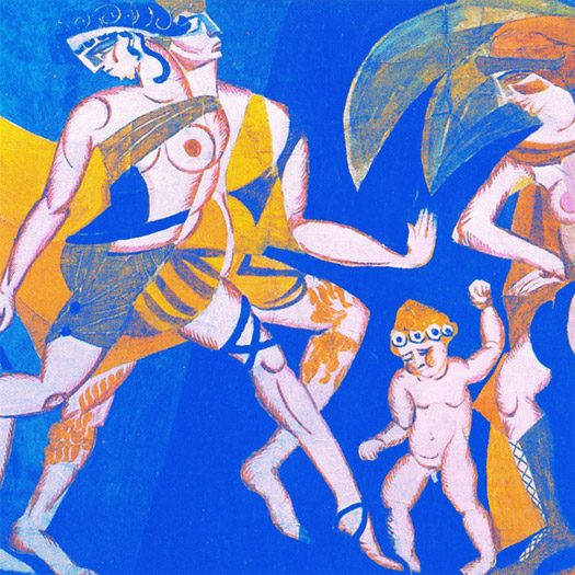
DESIGN BY EDMUND XAVIER
PAINTING BY ALEKSANDRA EKSTER – wikipedia.org/wiki/aleksandra_ekster
DESIGN BY MAGGIE FOST
ADDITIONAL CONCEPT BY NATHAN MICHEL OF HOSPITALITY
“Our main idea was to combine two very different design ideas: the painting of Katherine of Aragon, which is from around 1525 and the design for the Santa Cruz Duane Peters Skateboard, from the early ’80s. Maggie Fost, the designer, made those two elements work beautifully… We wanted something that would really stand out, even in thumbnail form. I think this one does that for sure. Also, I own a Duane Peters skateboard. I’ve had it since I was a kid.” – Nathan Michel of Hospitality


COVER ART BY UNKNOWN
INTERIOR CREST BY DAVID V. DANDREA – dvdandrea.com
The band declined to comment on the album artwork and would like to keep it open to interpretation.
A note from David V. Dandrea states that the cover is a traditional Greek Icon painting, though he is uncertain whether it is a contemporary interpretation or a vintage original.
DESIGN BY MUSEUM STUDIO – museumstudio.se
Artists could not be reached for comment.
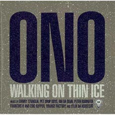
“The colors are slightly different on the US pressing, and if you look closely the first press cover is all matte except for the center of the font is glossy. We borrowed that idea from ’80s Polydor dance sleeves, particularly this Yoko Ono Walking On Thin Ice EP.” – Peaking Lights
ARTWORK BY ROBERT BEATTY – remainsstreet.com
INSIDE ARTWORK BY LEIF PODHAJSKY – leifpodhajsky.com
“A rule of thumb for us is that we always try to make something slightly reflective of the past. We drew from Cluster and Isley Brothers particularly in the final decision with the font. One other rule of thumb is that we make sure there is no bar code on the front or back, and Mexican Summer and Weird World were cool enough to let us approach the cover as pure artistic expression in itself.” – Peaking Lights
PROCESS & COLLABORATION
“[We] pretty much knew we wanted to have Robert Beatty do the cover of a record at some point; his art is amazing (so are his bands). I sent him a very loose sketch which had the Lucifer plugged In to a wall socket. He did a mock up and it was fine, but then we were really just vibin on the font he made; we thought it was stronger just as that. That was pretty much it — [plus] some loose stuff with size and color, but Robert is so good at what he does you can kind of let him run with it.” – Peaking Lights
THE EXTRAS
The insert was done by Leif Podhajsky — also an insane artist! He did our remix record on Domino’s cover [also]. With the insert, we had less of a clear idea of what we wanted, so that made it harder; there were a lot of revisions… but that was mainly us not being as clear in idea outside of wanting some sort of mandala.” – Peaking Lights


DRAWING & MANIPULATIONS BY ALEXANDER BURKART OF THE ZONDERS
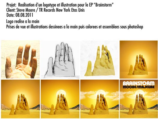
“Alex is very easy and fun to work with. I remember seeing him post a photo of the Mano del Desierto, a large sculpture of a hand reaching out of the Atacama Dessert in Chile. I mentioned to him that this could be a cool basis for the cover art and a few days later he was finished. Nailed it on the first attempt.” – Steve Moore
ARTWORK BY JARED RAGLAND – jaredragland.com
LAYOUT BY WILL STRATTON
THEMATIC ELEMENTS
“Once I had decided that the title was going to be Post-Empire, I gave Jared free reign with that information in mind, and he came up with a few different images, all of which had sort of palimpsestic qualities that appealed to me in other work that he has done. I chose the image of the rider because it seemed the most singularly focused of the things he made, and it was vaguely nationalistic, which I liked. So, from my perspective, it was a process of elimination.” – Will Stratton
“I can’t make work without some set of rules or parameters, so each of my collages are created within certain conceptual boundaries and employ images from specific image archives. The collage used for Post-Empire comes from a series of works I made a few years ago that were inspired by Alfred Tennyson’s poem, ‘Charge of the Light Brigade,’ and primarily built from photographs made by Roger Fenton during the Crimean War (a war that – much like our own recent ones – was largely unpopular and highly criticized).” – Jared Ragland
PROCESS & COLLABORATION
“Originally the cover image was a little more complicated, with a bird on the rider’s head and I think some other elements that I asked Jared to pare down. And I ended up messing with the hue of the image so that the background and foreground were different colors; it started out sepia. Aside from that, the image was entirely Jared’s.” – Will Stratton
“Will sent two early demos of the album so I could respond to what he’d recorded. His music is really intricate and beautiful, so I initially wanted to make something that could visually represent that beauty. And honestly, my initial attempts were complete failures. Fortunately though, Will’s music is more than just pretty melodies, and this particular set of songs is full of allegory and metaphor from which I could draw ideas. At some point during the process, Will announced that the record would be called Post-Empire, and I immediately thought of this collage from the ‘Light Brigade’ series. I rearranged a few things, sent it to Will, and he thought it was right for the record.” – Jared Ragland

2006 ORIGINAL
DESIGN BY JOE STEWART
PAINTING BY UNKNOWN (1600S PAINTER – “I saw at an art exhibit in Torino in 2005 called HELL.” – Jamie Stewart)
“My brother designs of our record covers. This is a reissue so we wanted a different cover, but I still wanted to use the central image. This was all I told him and just went for it. Blacker than black was the answer. I love that I can put it in his hands and he always makes something wonderful that I would never have thought of.” – Jamie Stewart of Xiu Xiu
[nextpage title="Narrative & Symbolic (14)"]
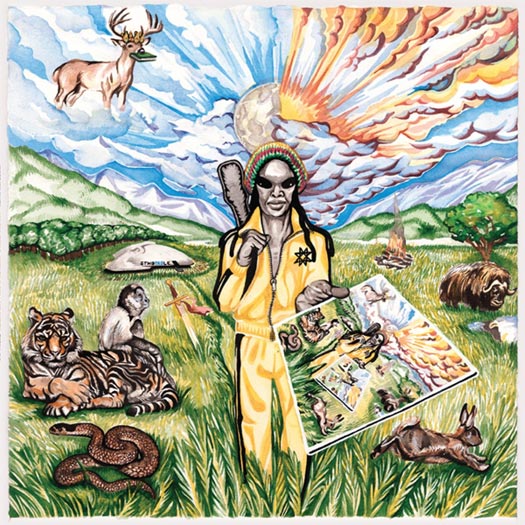
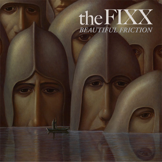
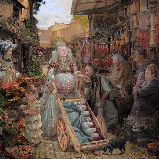
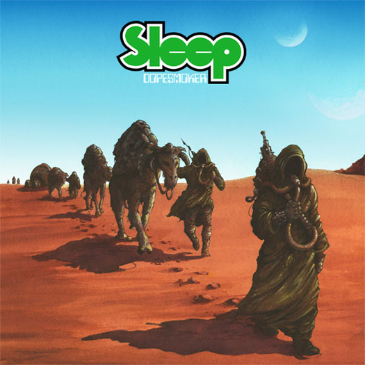

Baroness – Yellow & Green // Coheed & Cambria – Ascension // The Dandy Warhols – This Machine // Dawnbringer – Into The Lair Of The Sun God // Dragged Into Sunlight – Widowmaker // EARTH – Angels of Darkness & Demons of Light II // The Fall of Every Season – Amends // The Fixx – Beautiful Friction // Guardian Alien – See the World Given to a One Love Entity (Part 1) // mewithoutYou – Ten Stories // Murder Construct – Results // Shackleton – Music For The Quiet Hour / The Drawbar Organ EPs // Sigh – In Somniphobia // Sleep – Dopesmoker
ALL CATEGORIES:
“Normally, I would find the literal reinterpretation of themes heavy-handed and problematic; however, since I make the art for Baroness as well as play the music, I am able to keep our visual and sonic aesthetics quite close, often running directly parallel. The tricky obstacle is capturing the right atmosphere and tenor of our music, through color, tone and visual metaphor. What is the color or shape of reflection? Of anxiety? Of struggle?” – John Dyer Baizley of Baroness
ARTWORK & ILLUSTRATION BY JOHN DYER BAIZLEY OF BARONESS
PROCESS & COLLABORATION
“I spend a fair amount of time researching my concepts, in order to visually interpret them in a compelling, if somewhat obscured way. If I am too direct, the work suffers from over-explanation; if I am too obtuse, from being too fantastic. I often make reference to classical works and well-established paradigms so that I might offer a compositional foundation which the viewer feels a connection with — from which they may dredge out some new perspective or a deeper, more idiosyncratic understanding. The rest of the band is kept in-the-loop with this process. After all, they have to feel the same way about the art that I do. These records are part of our legacy, and we should all feel connected to the project. Devotion to the full-scope of our creativity is important to our survival and development.” – John Dyer Baizley of Baroness
THE EXTRAS
“Color is a tricky device for me to wrestle with. I don’t have any natural aptitude for it. Like all of my perceived weaknesses, it has become the focus of my artistic battle. Thusly, we have based entire record titles on color, and there is an abundance of time spent developing the right chromatic look for each album cover. More often than not, I use my creative muscle to attack my own shortcomings rather than developing my proven strengths. It is unsurprising, with respect to the fact that I am an artist, that so much of Baroness’ lyrical themes refer to colors and tones; that seems like an inevitability. However, I will take the stance now that future Baroness records will no longer have chromatic titles. That idea has run its course.” – John Dyer Baizley of Baroness
AUDIO-VISUAL COMPONENTS
“We’ve been considering adding a visual component to our live show for some time now, though we haven’t actually seen any of our ideas come to light. Look for something new in our live production soon.” – John Dyer Baizley of Baroness
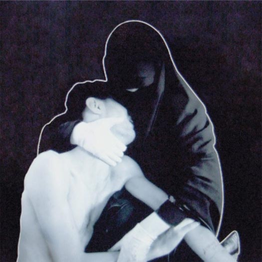
COVER ART BY HEIIDI TAILLEFER – heiditaillefer.com
BOOKLET ACRYLIC PAINTINGS BY NATHAN SPOOR – nathanspoor.com
GRAPHICS & PACKAGE DESIGN BY BILL SCOVILLE – scov.com
THEMATIC ELEMENTS
“The story is like an epic tale of a man (called Afterman) who heads into space to explore an energy band fueled by souls. Among these souls, he incorporates five into his suit, which fuel himself as well. Each of these souls — four men and one woman; three negative and two good — have personality traits unto themselves. One of them was once bad and turned to the good in the afterworld, so to speak. This Afterman heads up for a time that escapes him, since I guess interdimensionally, time ceases to be perceived, and after he comes back, he finds that his wife is deceased. He was so caught up in his explorations that he neglected her utterly and feels this huge pang of remorse and regret.” – Heiidi Taillefer
“There are lots of philosophical and thematic elements in Claudio [Sanchez of Coheed & Cambria]‘s series of narratives. It’s pretty complex, but if you follow the band and what Claudio has been doing, it’ll make a lot of sense. He told me about the concept and about what each song would mean or should include before I heard any of the music. Between recording sessions, we would talk about the ideas since I would keep sending over drawings of what he might be looking for. Once we got even a part of something right, I would then keep doing new pictures until we got the final idea approved. Some of them were really quick and some others we went through dozens of drawings until we got there.” – Nathan Spoor
COVER PRODUCTION BY STEVEN BIRCH
DESIGN, LAYOUT & PHOTOGRAPHY BY SEAN GOTHMAN – seangothman.com
COVER PAINTING BY HICKORY MERTSCHING – hickorymertsching.com
COVER PAINTING PHOTOGRAPHY BY DAN KIVITKA – kivitkaphotography.com
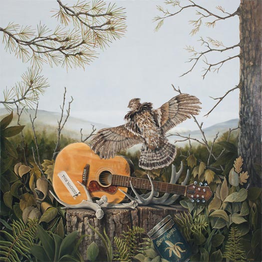
“Peter Holmstrom and Courtney Taylor-Taylor [of The Dandy Warhols] each expressed certain elements they wanted to see in the painting,specifically their guitar displayed on a stump. Courtney Taylor-Taylor sketched out a doodle of the rough layout on a envelope, and we discussed trying to create a very regional Northwest landscape with a woodsy feel as the backdrop. Also, with Mt. St. Helens in the far distance. The antlers represent the by-product/refuse of This Machine; the guitar is the tool which creates the means to the end, and the ruffed grouse, which is found in the foothills of the Cascades and Coastal Range, makes a drumming sound with its wing movement; it symbolizes the music by taking flight into the aural senses and audio.” – Hickory Mertsching
Artist unknown.
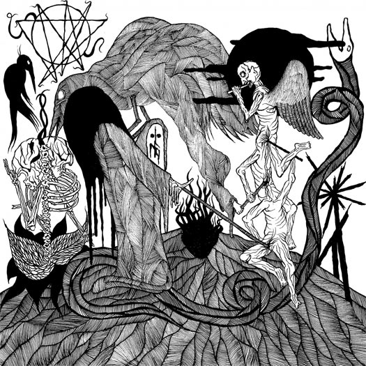
“We are very particular about our sound and whilst Widowmaker was a very relaxed process. We recorded at least three drum versions, at least three guitar versions and three bass tracks, in the end we double tracked the bass, it needed to sound like molten lava. A lot of drugs and a lot of fucking insanity. The album was recorded between our trips out to Portugal for SWR Fest, Holland for Roadburn and Maryland for Deathfest, as well as a month long US tour. There are vast portions of the recording that no one actually remembers, a lot of getting fucked up on places, boats and in the back of vans, but that’s what this is about for us. A total exorcism, the music is a reflection of the chaos that unfolds wherever we go. We also recorded a live backing track for the entire record inside the [Sedlec] Ossuary in Czech Republic.” – T of Dragged Into Sunlight
ARTWORK BY SINDRE FOSS SKANCKE – sindrefossskancke.com
THEMATIC ELEMENTS
“For me, as the artist who visualizes the music, it is of course important to get to know the ideas behind the music. We had lots of conversations before I started the physical work, and I of course listened to the album a lot. It was special working with Widowmaker; all of the visuals were done in an intense month isolated in my cabin. The ideas behind the album and the music corresponded well with my isolation at that point… I tried to nail the images that got into my head while listening to the album over and over, scraped down into whatever media that felt right for visualising the reality.” – Sindre Foss Skancke
PROCESS & COLLABORATION
“I got a lot of information before I started, then I would go to the city once a week and email my progress. I do not really work as a designer, so if I am going to work with a band, it has to be a band with both music and a vision that interests me. Good music needs custom visuals, and seeing this slice of music as a conceptual piece of sound, it would also need something that fits well visually, but also challenges it. I think we managed that.” – Sindre Foss Skancke
“We worked very closely together on an intellectual level and allowed an unspoken bond to grow. It comes from a creative drive innate with in both Dragged Into Sunlight and Sindre as an artist. When you are that passionate about a common vision, it’s almost telepathic, and the vision becomes a reality.” – T of Dragged Into Sunlight
AUDIO-VISUAL COMPONENTS
“Widowmaker has a 40-minute video which has not yet been released. It is produced by Dwid Hellion [of] Integrity. Integrity are as much of an influence as Eyehategod and all of the other raw to the bone artists out there. It has been our honor to work with so many great artists on Widowmaker. Only time can tell us what Widowmaker will look like; just like it has a sound and vision, it also has a form.” – T of Dragged Into Sunlight
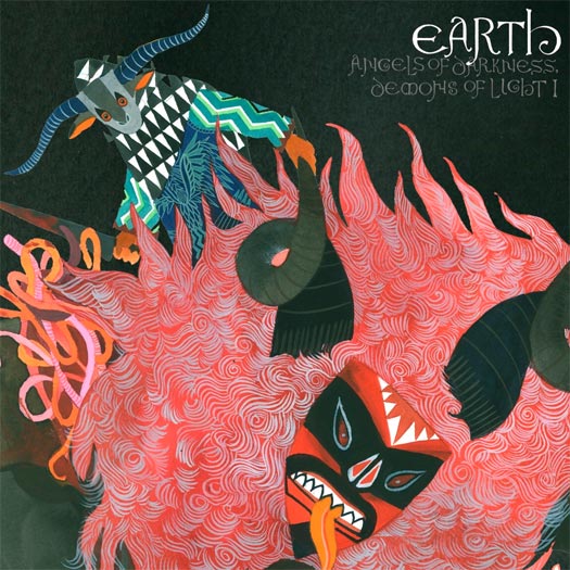
ARTWORK & ILLUSTRATION BY STACEY ROZICH
A visual continuation of Angels of Darkness & Demons of Light I. You can also read our interview with artist Stacey Rozich.
ARTWORK BY ROBERT HOYEM – attheends.com
BACK COVER PHOTOGRAPHY BY KIM KVALHEIM – kimvalheim.no
“This is actually the third shot at making the cover for the Amends. I’ve heard snippets and songs of the album over the last five years, so the album has been in the oven for quite some time. The initial ideas for the cover can be found on my blog, but after some time I decided to recreate the entire artwork — both to better reflect the music and lyrics and give the album a fresh boost. The artwork in its entirety is actually quite direct, and illustrates different aspects of the lyrics without any interpretation, more or less as an experiment to see how this kind of a cover would look in a more old school, illustrative approach.” – Robert Hoyem
“I feel that the grand scope of the album’s sound was reflected particularly well in the end result. It’s huge. Lyrically, the album contains a lot of very visual metaphors that work well as direct illustrations in the art.” – Marius Strand of The Fall Of Every Season
PAINTING BY GEORGE UNDERWOOD – georgeunderwood.com
ART DIRECTION BY TOMMY MOORE
“When The Fixx asked me to create an image for the cover, I had just finished working on a big painting called ‘I Talk With The Spirits’. I was really pleased they asked me because I had a good working relationship with them from the past with Reach The Beach, Phantoms, and Calm Animals. With the painting, the thought process was: lost civilisation, island of the dead, spiritual beings being visited or observed by another generation as if they were witnessing a religious experience [or] phenomenon. Then they said it was going to be called Beautiful Friction, and I realised that my painting could be interpreted exactly into that title. So I cropped it down until I thought it worked as a record sleeve.” – George Underwood
PAINTING BY TURNER WILLIAMS OF GUARDIAN ALIEN – turnerwilliamsjr.com
CONCEPT BY GREG FOX
“I was approached by the guy on the record cover; he showed me the album title and the art, which was him showing me the album title and the art. The idea was to basically just follow those instructions and not think about it too much otherwise. It was not a dream. I was fully awake when it happened. It is important to me that this is made clear. Calling it a dream suggests somehow that it didn’t really happen, and discounts it as not being as genuine of an experience as what we consider regular real life or whatever. I was fully conscious and completely stupefied by the experience, and to this day, I’m not completely sure what happened, mostly because I’m not sure how I feel about the whole alien phenomena in general.” – Greg Fox of Guardian Alien
MORE IMAGES AT CHARLIEWAGERS.COM
LAYOUT & DESIGN BY CHARLIE WAGERS OF THREE BEARS DESIGN – charliewagers.com
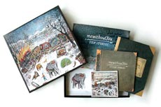
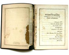
PAINTINGS BY VASILY KAFANOV, COMMISSIONED BY MEWITHOUTYOU – kafanov.com
ART DIRECTION BY AARON WEISS AND MIKE ALMQUIST – lookingiswrong.com
THEMATIC ELEMENTS
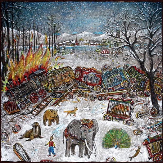
“The album artwork is meant to directly follow the storyline of the music contained in the album. The album is about a 19th century circus train that crashes in the mountains in Montana, and some of the animals escape. Each “story” is about the animals, where they go and what they do. For the artwork, Vasily Kafanov was commissioned to make a painting for each song, and another for the cover. The album artwork ties each painting to the songs, in such a way that it feels like an old, worn-out storybook from the same era.” – Charlie Wagers
PROCESS & COLLABORATION
“I love working with mewithoutYou because they are unlike any other band when it comes to artwork. They are always very involved in the artwork process. I would talk to Aaron Weiss (the band’s singer) or Michael Almquist (manager) at least once a day to check-in on the process. It’s great working with a band that is this involved; they are very critical, which is always pushing things to look their best. They also were consistently providing me with great ideas.” – Charlie Wagers
THE EXTRAS
“Vasily made 14 paintings, while I handled all other mediums. I did a lot of scanning old books and paper, to get the proper textures and little flourishes to add to the pages. I also spent a lot of time with the typography; namely the typefaces Mrs. Eaves & Dunelm, slightly distressing the letters to have the appearance that they were printed on an old printing press…”
“This was definitely a non-conventional album to create the packaging for. We did three different versions: a deluxe box-set that contained a double LP’s, a gatefold-packaged 7″, 18-page storybook and alternate-art CD. As well as a gatefold “standard” edition LP on colored vinyl, and a CD, both which came with a 12-page lyric booklet. And also an accompanying 7″ single for February 1878, with the b-side Four Fires… My favorite part of this package was the etching on the D-side of the deluxe-edition vinyl. It was my first chance to tackle illustrating for a vinyl etching, and I wanted it to follow the contours of a round record. The result was several of the stories’ animals, strung along in a circle around the record.” – Charlie Wagers
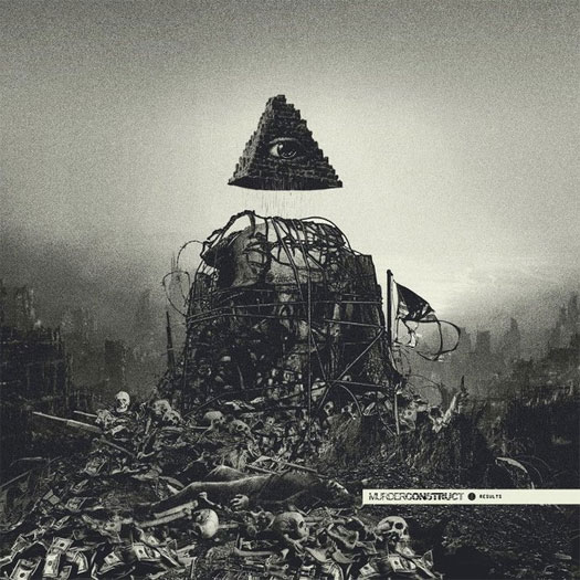
DESIGN BY ORION LANDAU – orionlandau.tumblr.com
“Orion kept us in the loop every step of the way. We initially had some other ideas for the artwork which weren’t fully fleshed out, and when Orion showed us what he was working on, we knew we were looking at what I would consider to be cover art of the year, haha.” – Leon of Murder Construct
The box set contains three 12″s, one CD, and one 12″ x 12″ booklet of artwork from Clough.
ARTWORK BY ZEKE CLOUGH – zekeclough.com
THEMATIC ELEMENTS
“It was partly inspired by the text by Tenfold Vengeance that was included in the release, by a conversation with Sam about the nature of a possible future apocalypse and by [his] own thoughts on time… The time aspect’s represented by the characters marching through the lens of the present. This was meant to show time as a way of defining the possible permutations of the past, (would have, should have, could have) and the potential of the future — pretty much my frustration that the potential of a lifespan is inevitably defined by the passage through time.” – Zeke Clough
“[The passage by Tenfold Vengeance] concerned a letter to his granddaughter who lives in the year 2065. Zeke told me that he had been working on themes which seem to overlap with the basic concept. We thought that it would be good to try to tie this all together with one package. From this early foundation, Zeke had free range but had input from Vengeance Tenfold’s words to interpret as he felt fitting… I do not really have a rule when it comes to Zeke’s stuff as he has his own fertile imagination and great ability. His sensibilities tie in with my own, pretty much. The only thing that I am a stickler for is aesthetic consistency for each series. This means that the artwork for this release needed to be stylistically connected to the previous Woe To The Septic Heart release and that these releases in turn needed to be stylistically different again from the Skull Disco releases.” – Sam Shackleton of Shackleton
THE EXTRAS
“There was also a vague story about charactors escaping a churning, primordial landscape by travelling into the bottom of a volcano. In the bottom of the volcano is relative tranquility and they are confronted by the time-defining gate/lens.” – Zeke Clough
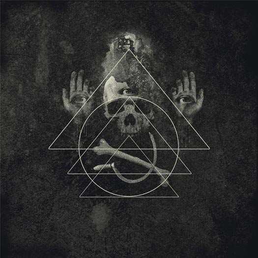
ARTWORK & CONCEPT BY ELIRAN KANTOR – elirankantor.com
“All I did was to tell Eliran that the album concept was nightmare and to give him some demo tracks and the lyrics. I really did not think I had to give him further instruction or anything, as I 100% trusted him as an artist and I was completely sure that he would understand what kind of visions I had in my mind. We worked together for the previous album, Scenes from Hell, so I knew leaving almost everything to him would generate the best result.” – Mirai Kawashima of Sigh
AUDIO-VISUAL COMPONENTS
“Visuals are always very important live. We use a lot of fire and blood gimmicks and it’s not the same old pyro machine or anything. Most of those gimmicks are handmade by us, and I’m sure people have never seen a show like ours before.” – Mirai Kawashima of Sigh
THE EXTRAS
“All I’m willing to give out is a small silly trivia detail: in a classic Kind Diamond-like manner, the pregnant queen is based on my grandma. Nightmarish enough?” – Eliran Kantor
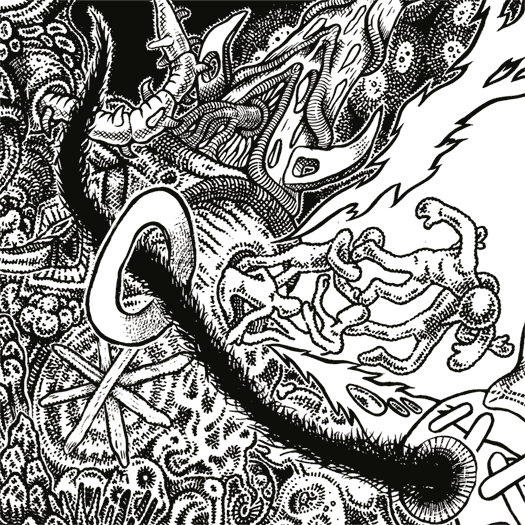
ARTWORK BY ARIK ROPER – arikroper.com
[nextpage title="Photography & Manipulations (18)"]


MANIPULATED PHOTOGRAPHY
Acid Pauli – mst // Anberlin – Vital // The Antlers – Undersea // Bat For Lashes – The Haunted Man // Bomber Jackets – Centurion Travel 7″ // Callers – Reviver // Chromatics – Kill For Love // Clock Opera – Ways To Forget // Crystal Castles – III // Flying Lotus – Until The Quiet Comes // Miniature Tigers – Mia Pharoah // Naomi Punk – The Feeling // Paloma Faith – Fall to Grace // Ponderosa – Pool Party // Raime – Quarter Turns Over A Living Line // Savior Adore – Our Nature // Scissor Sisters – Magic Hour // Sleigh Bells – Reign of Terror
![]()
ALL CATEGORIES:
PHOTOGRAPHY BY CAPERO
DESIGN BY STEFAN BOGNER
“I was looking through photos with Capero, and we selected some that we might wanna use for the artwork. This one instantly touched me in a strong way, and I felt there was some kind of connection between the picture and the music. Nevertheless, we sent all the pics we selected to [label co-owner Nicolas Jaar]. Guess what? He chose the same picture to be his favorite. So I sent it to my friend Stefan Bogner who is an amazing designer — one of those hard-to-find creatives who really know how to reduce to the maximum. He made some drafts, and we all liked the one which is upside down, [with] the little picture reversed, so that you don’t really get it at first sight. For me that’s a graphical synonym of what I try to make with music as well.” – Acid Pauli

LAYOUT, DESIGN, ART DIRECTION, COLLAGES BY JORDAN BUTCHER – workofself.com
ART DIRECTION BY NATE YOUNG OF ANBERLIN
CUSTOM TYPOGRAPHY BY DARREN BOOTH – darrenbooth.com
COVER PHOTOGRAPHY BY AARON FEAVER – feaverishphotography.com
BAND PHOTOGRAPHY BY BLISS BRAOUDAKIS – blisskatherine.com
“Nate and I are like two peas in a pod on the artwork, usually. Our working relationship has grown to be a little direction up front, and then I’m sort of let loose. Usually when we disagree, we make fun of each other a bunch and then the outcome is much better. We have a unique kind of deal to be friends first and work on stuff like this when the time arises, so it’s actually a lot more fun for me than a usual package, and I tend to get a little more invested in Anberlin releases. For better or worse.” – Jordan Butcher
THE EXTRAS
“All the [interior] collage photos are the same girl. The gradients and color blocks happened by accident during the layout process… But I ended up letting them be the (in my opinion) main piece of the art… They kind of differentiate the different versions of the record that are out there.” – Jordan Butcher
“We only pressed the album on two 10″ instead of the standard 12″, and side D is fully smooth, with no etching. I’ve personally never seen that done. I’m not saying it’s groundbreaking, but it’s close. Ha.” – Nate Young
Artist unknown.
PHOTOGRAPHY BY RYAN MCGINLEY – ryanmcginley.com
Artist could not be reached for comment.
ARTWORK BY BILL KOULIGAS
Artist could not be reached for comment.
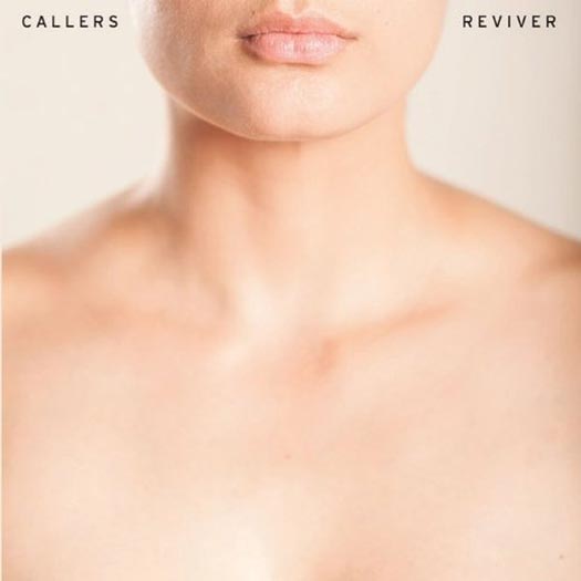
PHOTOGRAPHY BY DERRICK BELCHAM – astorytoldwell.com
DESIGN BY SARA LUCAS, RYAN SEATON & LAUREN WOLFF
THEMATIC ELEMENTS
“Our last album cover for Life of Love in 2010 was a 4×4 foot colorful oil painting done by our friend Douglas McQueen, an artist living in Brooklyn. We really love how that turned out as it was very appropriate for that record — but for Reviver, we went in the complete opposite direction. With the photograph we chose, we wanted to present the album as something extremely personal and close to the skin. When creating the artwork for our albums, we’re not driven by branding and we want the album that we created to dictate the visual aesthetics, not necessarily the personality of the band or its members. This might backfire for us as we know that branding and icons sell these days. But since branding does not drive our sound or our writing, it’s not going to dictate our cover art either. Oops…” – Sara Lucas of Callers
PROCESS & COLLABORATION
“Initially, we had a very different idea of what the cover was going to look like and spent a very long time ruminating over it. The day before the artwork was due for the record, we realized that our initial idea wasn’t going to work. We called up Derrick Belcham and told him what we wanted. We went to his house after working all day, and he spent an hour getting the shot. It was very simple in the end and was finished in only a matter of hours. A friend of ours who is a designer, Lauren Wolff, helped us out with the type and placement afterwards. The cover was put together in one day… All I can say is you can spend months thinking about a cover and trying to execute it, totally fail and then spontaneously make it happen in a matter of hours.” – Sara Lucas of Callers
DESIGN BY JOHNNY JEWEL OF CHROMATICS – facebook.com/chromaticsband
The band declined to comment and would prefer to keep the album artwork open to interpretation.
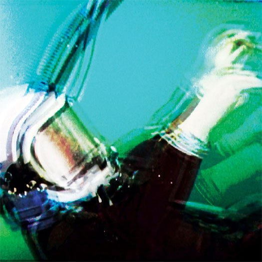
ART DIRECTION BY RICHARD ROBINSON – richardrobinsondesign.co.uk
PHOTOGRAPHY BY MADS PERCH – mads-perch.com
“[Me] and Mads Perch had an extensive meeting with the band [to discuss] directions for the campaign. They had a clear idea of how they wanted the record to feel — not so much of a finished visual, more the message they wanted to convey. They had references of Picasso paintings, distorted screens, vibrant colours and movement.
We took this on board and were really interested in the movement aspect, and particularly the work of Gjon Mili. Having experimented with multiple exposure techniques before, it was a great opportunity to push it further. The band are friends of a group of dancers called The New Movement Collective, and they were happy to come along and let us shoot them for the project. We had four dancers in total and over a day-long shoot, had them perform routines [we captured] as we went. Once we’d done the shoot, the band felt that it needed more emotion and colour, so I worked extensively processing the images to create a more layered, textured piece that had more of a painted quality, which ultimately reflected the music more accurately.” – Richard Robinson
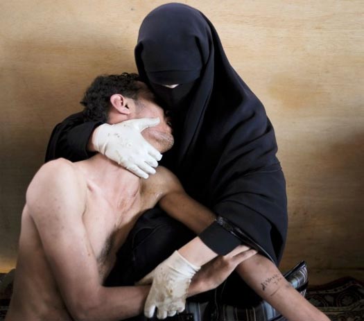
ORIGINAL COLOR PHOTOGRAPHY BY SAMUEL ARANDA – samuelaranda.net
The main image used on this album cover was manipulated for III, but a description of the original image is as follows:
“Fatima al-Qaws cradles her son Zayed (18), who is suffering from the effects of tear gas after participating in a street demonstration, in Sanaa, Yemen, on 15 October. Ongoing protests against the 33-year-long regime of authoritarian President Ali Abdullah Saleh escalated that day. Witnesses said that thousands marched down Zubairy Street, a main city thoroughfare, and were fired on when they reached a government checkpoint near the Ministry of Foreign Affairs. Some demonstrators retreated, others carried on and were shot at again. At least 12 people were killed and some 30 injured. Ms. Qaws—who was herself involved in resistance to the regime—found her son after a second visit to look for him, among the wounded at a mosque that was being used as a temporary field hospital. Zayed remained in a coma for two days after the incident. He was injured on two further occasions, as demonstrations continued. On 23 November, President Saleh flew to Saudi Arabia, and signed an agreement transferring power to his deputy, Abdurabu Mansur Hadi. Saleh’s rule ended formally when Hadi was sworn in as president, following an election, on 25 February 2012.”
ART DIRECTION & DESIGN BY STEPHEN SERRATO OF B+ – sserrato.info
PHOTOGRAPHY BY DAN KITCHENS
Artists could not be reached for comment.
Artist unknown.
ARTWORK BY NAOMI PUNK
Artists could not be reached for comment.
DESIGN & LAYOUT BY CHRISTOPHER J. PORTER – iseesea.co.uk
PHOTOGRAPHY BY DAVID STANDISH – davidstandish.co.uk
Artists could not be reached for comment.
ARTWORK by ROB CARMICHAEL OF SEEN STUDIO – seenstudio.com
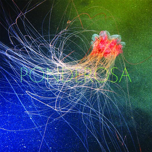
PHOTOGRAPHY BY ALEXANDER SEMENOV – clione.ru
“We wanted the music to drive the visual concept, so a psychedelic image for the album cover seemed fitting. However, we wanted to stay away from anything created in Photoshop. We felt that there was enough of that type of album art out there and didn’t want to do something that was already overdone. JT discovered the work of oceanographer and marine biologist, Alexander Semenov, specifically the jellyfish image and he was really passionate about using it as the cover. The rest of the band loved it. It was psychedelia in nature, it was a no-brainer. Fortunately Alexander is an awesome dude and granted us permission to use the image.
This species is the lion’s mane jellyfish and was photographed in the White Sea.” – Jeremiah Romo of Ponderosa
Artist unknown.
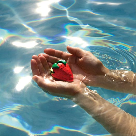
PHOTOGRAPHY BY LEAH ECKLIND
DIGITAL PAINTING BY DOUG OLSEN – dougolsen.com
DESIGN, LAYOUT & TYPOGRAPHY BY JULIAN BIALOWAS – julianbialowas.com
PROCESS & COLLABORATION
“The creation of the artwork was pretty complex for a few reasons, so we ended up working very closely with the artist(s) throughout the process. Unfortunately, there was no high res version of the photograph anymore, so it had to be re-enhanced and painted digitally. The cover is not simply a photograph, and wouldn’t have been possible without the work of three artists. It’s a digital painting of a photograph and then the typography and “circle frame” were created by a graphic designer. Leah Ecklind is the photographer, Doug Olsen is the painter, and Julian Bialowas was the graphic designer. We worked pretty closely with them, but for the most part, they perfectly captured what we were hoping for at each step.” – Savior Adore
THE EXTRAS
“We just found it so interesting and inspiring that we found the art and the artists we worked with all online. First we stumbled across the photograph on a friends page, then it took two weeks to track down the photographer, Leah (also would not have been possible without social networking), and then we ended up asking Julian to do the graphic design (we had followed his Tumblr page all year).” – Savior Adore
“I really wanted to focus on the lyrics and typography for this album. So often, lyrics are tucked away in books and miss out on the action, typically being set in standard 12-point, left-aligned format. With this layout. it’s the first thing listeners see before they even get to the disc… each and every line you see in the interior panels was 100% hand set, line by line, word by word, letter by letter. And believe it or not, it was done twice! (The original final designs were lost in a hard drive failure so the entire layout had to be redone by hand.) [It] was an insanely tedious process but so very worth it; the lyrics most definitely deserve the attention they got.” – Julian Bialowas
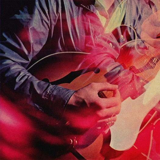
PHOTOGRAPHY & ARTWORK BY NEIL KRUG – neilkrug.com
DESIGN BY TREVOR TARCZYNSKI – studiodestro.com
“[Collaboration was] pretty close, in particular with Scott Hoffman (Babydaddy) from the band. He and I spoke almost everyday about ideas and new designs. Since the project was based in 3D, the options for perspective were endless, so it took us a moment to dial in what we were after.” – Neil Krug
“The story I love to tell is about the cover. They had a different idea that they were passionate about but wasn’t going to be addressed right away, so I hired Joe Garrad to shoot these objects that Derek [Miller] and Alexis [Krauss] collected. If my memory serves me correct, they weren’t sold on their own idea of showing bloody Keds in the booklet. (Keds is an icon that represents Alexis since that’s pretty much all she wears. [with] blood to show pain and aggression which is very much within the songs themselves.) I said, ‘Let’s just shoot it; if we use it, we use it. If not, no harm done.’ After going back and looking at all the shots with Joe, I decided to put everything on a cream background to make it feel more like a considered piece of art, and the shoes JUMPED off the page. In our next meeting, I said something along the lines of, ‘Guys, I know you love your cover idea, but here’s your real cover’ (I probably didn’t come off as smooth and confident as that, but let’s just go with it) and showed them the Keds. Alexis and Will, the manager, immediately loved it. Derek liked it and said he wanted to live with it for a night and called me up the next day saying we nailed it. The decision to take the type off of the cover came a little later when it just felt like Joe’s photo was so much more powerful with no typography to share the attention.” – Steve Attardo
DESIGN & LAYOUT BY STEVE ATTARDO – stevenattardo.com
PHOTOGRAPHY BY JOE GARRAD – joegarrad.com
ART DIRECTION BY DEREK MILLER OF SLEIGH BELLS

ADDITIONAL IMAGES AT STEVENATTARDO.COM
PROCESS & COLLABORATION
“This was a 100% collaboration. Sleigh Bells came to me with a pretty clear vision and passion for how they wanted to be perceived, what they wanted to include, and the story (though confusing and non-linear) they wanted to tell. From there, I felt it was my job to take it all in and show them which ideas were working, which weren’t, and how to show it in a considered / better way — how to make it really speak. We were working with a pretty simple and clean aesthetic from the start, so it really became about art direction and details.” – Steve Attardo
[nextpage title="Collage, Sculpture & Mixed Media (14)"]


3D MIXED MEDIA
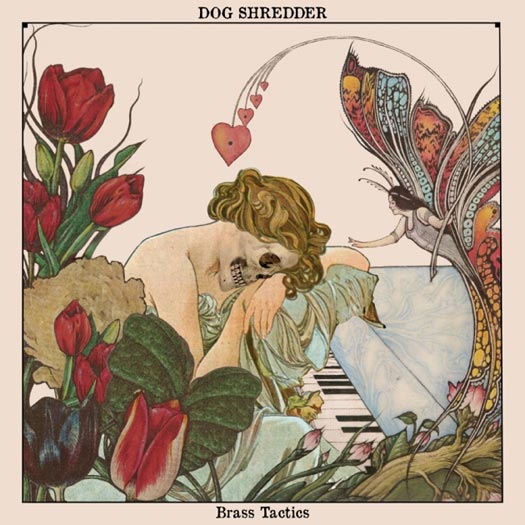
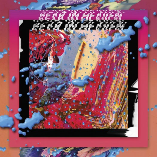
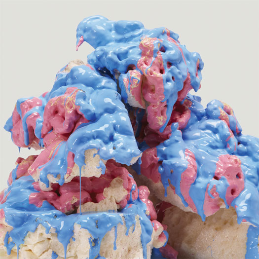
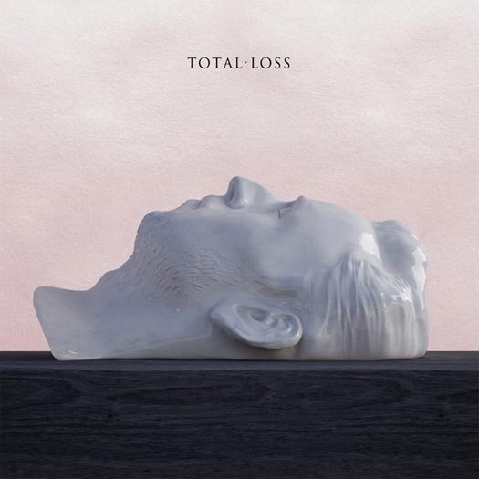
A Place To Bury Strangers – Worship // Alice Cohen – Pink Keys // Battles – Dross Glop Series // Bear in Heaven – I Love You, It’s Cool // Clown & Sunset – Don’t Break My Love // The Darkness – Hot Cakes // Dog Shredder – Brass Tactics // How To Dress Well – Total Loss // Tin Can Radio – Open Ears, Open Minds // Sun Airway – Soft Fall // Turbo Fruits – Butter // White Lung – Sorry // Woods – Bend Beyond // Young Magic – Melt
![]()
ALL CATEGORIES:
DESIGN BY DANIEL MURPHY OF SECRETLY CANADIAN
PHOTOGRAPHY BY DION LUNADON OF A PLACE TO BURY STRANGERS
“I took this picture while driving around Manhattan, and it sparked the idea to take photos in that area. Dion [Lunadon of A Place To Bury Strangers] shot the photo on one of our jaunts downtown, and then it was reworked by Daniel Murphy at Secretly Canadian.” – Oliver Ackermann of A Place To Bury Strangers
“The artwork is a combination of original photos taken by the band, along with some found photos, that have been collaged and heavily manipulated to push the colors in a more confrontational direction. We were hoping to invoke a sense of disorientation and vertigo with the design – to give the viewer the sense of moving at a great speed without being sure whether they’re going up or down. It felt like a good visual representation of the intensity of the music, without really being as visually dark as much of their previous album artwork. It’s an attempt to achieve “heaviness” with a lighter touch.” – Daniel Murphy

The photo on the insert for Pink Keys came from an old French film magazine, from the late ’60s, and is a still from the 1969 film Le Grand Meaulnes (pictured). The scene is called La Fete Etrange, and contains people dressed in colorful and bizarrely fantastical costumes. That image was an inspiration for the song “La Fete Etrange” and really piqued my curiosity, conjuring scenes of parades and processions of strangely dressed characters. – Alice Cohen
ART DIRECTION & DESIGN BY ALICE COHEN – alicecohen.bandcamp.com – AND TODD LEDFORD – oesbee.blogspot.com
THEMATIC ELEMENTS
“I came across the illustration of the keys in an old encyclopedia from 1938. The illustration was square, as an album cover is, and was basically used “as is” for the album art… something about the color scheme, and the design just grabbed me completely, and I said, “That is my next album cover”. I showed it to Todd from Olde English Spelling Bee Records, and for the following year after finding this picture, we called the concept and the album “Pink Keys”, based on the muted pink background color of the illustration. From that, I got into the symbolic ideas of “keys” and locking/unlocking as psychological/mystical concepts, which inspired me throughout the creation of the album. The color “pink” tied into this as well… so the one original image of the two keys on the pink background unlocked an entire world of ideas and metaphors that I could play with lyrically, musically and conceptually. – Alice Cohen
PROCESS & COLLABORATION
“[Todd and I] had worked together in the past on album art, and knew how each other work and what we were going for. We are both very particular about everything, including fonts, and we don’t like to use computer fonts at all…the lettering for the album was hand-done with colored pencil and stencils. We made an alphabet, scanned it, and put it together letter-by-letter. Both Todd and I like the artwork to be a sort of experimental and magical process – personal and done our “own way”, cohesive, and a very crucial part of the entire package – as important as the music, actually, and able to contain the same vibe as the music. We would pay a lot of attention to detail, and try a lot of things with lettering, lay-out, color, texture of paper etc – and all the details matter, no matter how minor they might seem. – Alice Cohen
AUDIO-VISUAL COMPONENTS
“As an animator, and video artist, I have performed live with my animations projected behind me. It makes for a really immersive performance, where the audience sees how my mind works visually as well as musically, and there’s usually a lot of connection between the two; even if I don’t plan it out, the audience can make connections between the two forms of expression.” – Alice Cohen


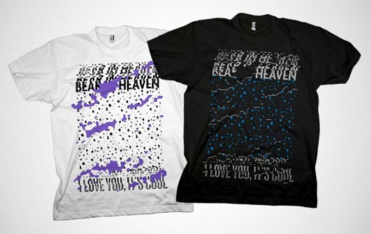
“I really enjoyed working on the tees which also had many variations — 3 colorways for the black body, a hypercolor version with inks that change in the sun, a floral print and a remix of the eyes from Beast Rest Forth Mouth. The initial feedback on the album art was pretty exciting as it was incredibly polarized. There were a lot of haters for sure… I was psyched that that many people took the time to discuss it at all, as it’s pretty hard to get any kind of reaction these days. I was actually hoping for Vice Magazine’s worst cover of the month slot although I’m not sure if they even do that any more.” – Sadek Bazaraa
ART DIRECTION & DESIGN BY SADEK BAZARAA – sadekbazaraa.com
MOTION DESIGN ON WEBSITE BY ADAM WILLS OF BEAR IN HEAVEN
WEBSITE DESIGN BY NATE UTESCH – nthnl.com
“I’m sure Sadek had some grand plan. We were so focused on making the music that we left the artwork in his hands. Hometapes is also a big force in all of our artwork. They’re willing to push things to a new and fantastic levels.” – John Philpot of Bear In Heaven
PROCESS & COLLABORATION
“We’ve always worked closely on the album designs. The previous albums had a bit more interaction in that regard as I was still a performing member of the band. Removed from the rigors of practice, songwriting and touring, I was able to put more time and focus into the art direction of ILYIC. I put some mood boards together to get initial impressions from the gang and hit the ground running from there… There was a barrage of both analog and digital processes explored — scanner manipulations, Photoshop filters, photography, etc. I’m usually very process-oriented and generally most excited about experimenting with new juxtapositions and techniques to see what emerges. Perhaps ‘process’ would be considered the primary technique in and of itself.” – Sadek Bazaraa
“Sadek was in the band for years, so we’re comfortable communicating about creating something. He would listen to demos and generate ideas… I think we met up three times; in each meeting, he would take us on a visual journey. By the end of it, we would have made a few choices and had a few beers.” – John Philpot of Bear In Heaven
THE EXTRAS
“Sadek named the record by accident. He was in our practice space listening to demos and left me a note. It said, “Dear Jon, I love you, it’s cool.” – Jon Philpot of Bear In Heaven
ARTWORK & PACKAGING DESIGNED BY NIKITA QUASIM
“The prism is an aluminum cube, small enough to fit in your palm. It was designed by Jaar as a new medium for releasing music. This first release — CSA001 — features twelve (mostly) unreleased songs from Jaar and other Clown & Sunset collaborators.
The prism is a piece of art in and of itself; its contents beg to be shared. Twin headphone outlets encourage connections to the object and between the two listeners. The prism tries to restore physicality to the listening experience.
The medium and the method are as important as the music itself. The prism makes you consider how the music is being heard, the way the object feels in your hands, and its potential to foster intimacy between listeners.
When the prism is unplugged, a beam of light passes through the empty center, revealing a void. Someone is missing.” – Clown & Sunset


CONCEPT BY THOM LESSNER
PAINTING BY DIEGO GRAVINESE – diegogravinese.com
LAYOUT & DESIGN BY TOURIST – wearetourist.com
“Tourist put forward style boards for various props including gold bikinis, sunglasses, etc., the look of the models from magazine reference as well as how we wanted the syrup to drip off the pancakes… We sent all the style books to the band to approve before the shoot commenced. The band’s brief was to create ‘an unapologetically mainstream 70′s porn, kitsch Linda Lovelace vs Raquel Welch vibe’ with big, bold retro looking typography.
Trying to find a 3D-modeling company in London to build three giant 8-foot pancakes within the budget was impossible, so we had everything created in Argentina for the shoot… Diego was let loose to transform it into a retro looking piece of art after a considerable amount of retouching on the final photo to get the syrup looking just right. The album is out on CD Deluxe and gatefold LP mushroom vinyl on August 20.” – Rob Chenery of TOURIST, via DiegoGuevera.com

MORE PROCESS PHOTOS CAN BE SEEN AT DiegoGuevera.com
ARTWORK & DESIGN BY JOHN OVERLY
Artist could not be reached for comment.
DESIGN BY JOSH CLANCY, TRAVIS STEARNS, AND PATRICK NORTH
ARTWORK BY MILE ERROR OF 3D
PROCESS & COLLABORATION
“Since we were working remotely from each other, it was too difficult to sculpt a real mask from Tom’s face and get it photographed just right. So instead, we opted to hire a 3D artist, Mile Error. We chose to render Tom in 3D because it allows for the control and construction of another, hyperreal world that is achievable with a relatively low production cost.” – Joshua Clancy
AUDIO-VISUAL COMPONENTS
“I incorporate visuals created by my long time friend, Nicky Reed. The visual element is paramount for the live show as it really brings home the affect of each song. The visual aspect of the show helps create an effective ambiance in which my songs can really take root and make a deep experience, for me and for the audience, truly possible.” – Tom Krell of How To Dress Well
ARTWORK & DESIGN BY SAM CHIRNSIDE – samchirnside.com
Artist could not be reached for comment.
“Closer to the album release VICE Noisey gave away the original clay sculpture to promote the record. I thought it would be cool for a fan to have it. It’s the kind of thing I’d value if I was a fan of a band.” – Matt Hearn of Turbo Fruits
SCULPTURE BY MATT HEARN OF TURBO FRUITS W/ HELP FROM RUBY ROGERS
PHOTOGRAPHY BY ERIC ENGLAND
THEMATIC ELEMENTS
“We wanted an album name & album art that was striking but not loaded. We’re not a controversial or political band. We’re a rock n’ roll band with a lot of ’50s, ’60s, and ’70s rock influence, so we wanted an image that had the vibe of that era. Jonas and I worked together on the record art. Jonas came up with the name, Butter, and the idea of having a stick of butter with lettering on it. I saw what I wanted and started creating mockups out of yellow paper at the printing company I used to work at. I then worked with Ruby Rogers of the Black Belles to figure out how to carve the lettering out of clay so the negative space would have a lot of depth. I wanted it to look epic, like a miniature Stonehenge or something… I used clay to continue the medium used for the Echo Kid record cover and the hand-made feel of all the Turbo Fruits LPs. We wanted it to be something tangible & real but kind of surreal at the same time.” – Matt Hearn of Turbo Fruits
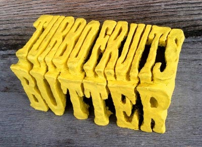
PROCESS & COLLABORATION
“Once the clay sculpture (http://turbofruits.com/08/2012/win-pot-butter-vinyl-1100-the-butter-sculpture-from-the-album-art/) was ready we met up with photographer Eric England (http://www.ericengland.net/) who I had photograph the sculpture from the same vantage point as a real stick of butter on a dish from Jonas’ parents’ house. After that, it was just a little Photoshop magic to get the sculpture to mesh with the background image.” – Matt Hearn of Turbo Fruits
DESIGN BY RYAN DYCK
COVER ARTWORK BY JUSTIN GRADIN – justingradin.com
Artists could not be reached for comment.
Artists unknown.
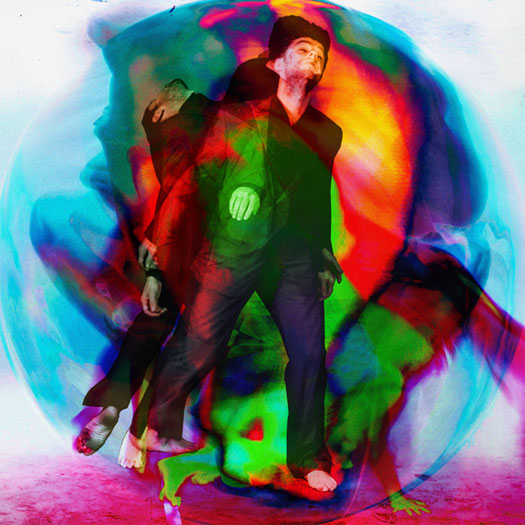
ARTWORK & CREATIVE DIRECTION BY LEIF PODHAJSKY – leifpodhajsky.com
THEMATIC ELEMENTS
“I think it was a product of resonance. Resonance in ideas and long talks. Leif had sent us this image before the album was completed, and it immediately spoke to us. Sometimes an image just jumps off the page and commands you to spend more time with it, to participate and engage with it. It symbolised the same palette of feelings we were exploring on this record; it too was sending out little tentacles into the world, seeing who it would touch. It amplified a lot of ideas Leif and I were discussing at the time. The beauty, colour and blur beyond the mundane. Breaking open the head. The intrinsic holographic equilibrium.
I’d eventually see the cover figure as existing in one level of these subtler levels of reality — don’t ask me which one — perfectly equanimous, although the image seemed to change shape every day I looked at it. It was as if someone had managed to sneak a photograph of the holographic world in its raw state, when all the concrete and tangible levels of reality had been surpassed and dissolved, leaving just the essence. A flick of the thumb, a peacock feather, a figure. It was all the same thing. The image was dense, complicated and very simple at once, like the music on Melt. – Isaac Immanuel of Young Magic
PROCESS & COLLABORATION
“I know [Young Magic's] music and ideas well. I had free reign; it was a pretty organic process and one of the first pieces I did. It actually started out as an artwork for a side project, but once I created it, I knew there was something special about it. I got that feeling.” – Leif Podhajsky
“It was Leif’s concept, entirely and completely. Both 7″ covers before Melt had been monochromatic, so we were definitely searching for color. He sent us a near finished version, and all we did was drag out the process, umming and ahhing on details, getting the colors right for weeks, until the deadline approached and we had to get real. Haa.” – Isaac Immanuel of Young Magic
[nextpage title="Painting & Illustration (17)"]

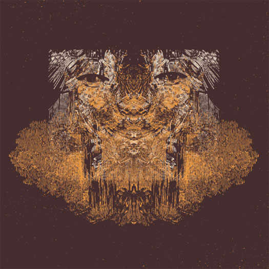
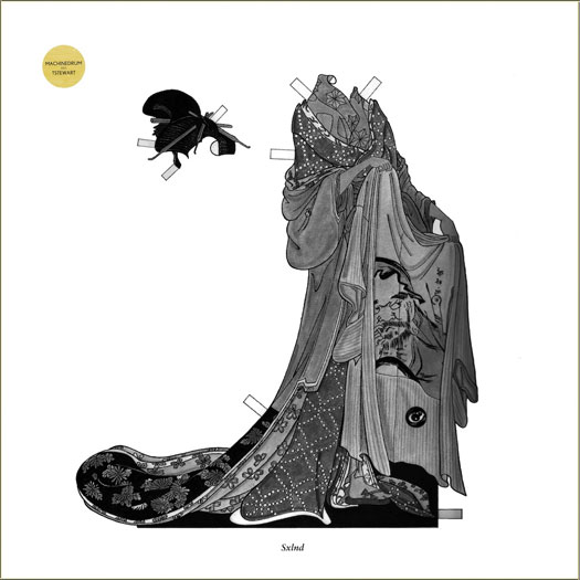


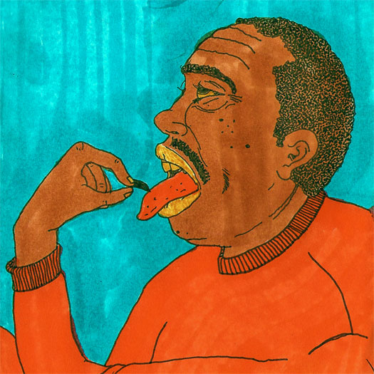

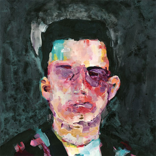
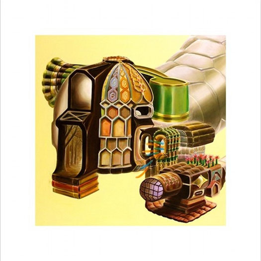

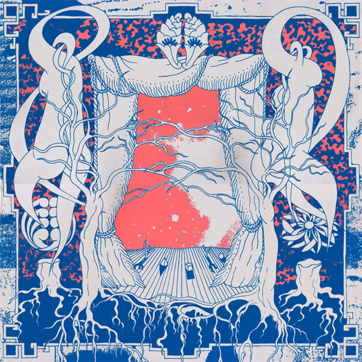
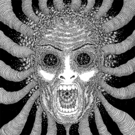


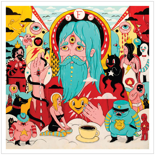

CHAOTIC
Altar Eagle – Nightrunners // Decimus – 11 // Dustin Wong – Dreams Say, View, Create, Shadows Lead // Father John Misty – Fear Fun // Fergus & Geronimo – Funky Was The State of Affairs // Generationals – Lucky Numbers // Lord Huron – Lonesome Dreams // Machinedrum – SXLND // Matt Carlson – All Moments // Matthew Dear – Beams // Swans – The Seer // Laurel Halo – Quarantine // Moon Duo – Circles // Of Montreal – Daughter of Cloud // Samantha Glass – Mysteries From The Palomino Skyliner // Spires That In The Sunset Rise – Ancient Patience Wills It Again Part II // Three Legged Race – Persuasive Barrier // Tilly & The Wall – Heavy Mood // Torche – Harmonicraft // Ty Segall Band – Slaughterhouse
![]()
ALL CATEGORIES:
PAINTING BY RADEK DRUTIS – www.radekdrutis.com
THEMATIC ELEMENTS
It might have been inspired by some things I was interested in at the time, like some vintage Killed By Death 45′s, The Nubs’ “I Don’t Need You”, for example, this old UK comp called Back Stage Pass with Manufactured Romance on it, and a lot of ’60s-’80s Polish cinema. – Radek Drutis
With Nightrunners, we had actually already decided on a totally different cover, and I was working with Radek on art for something else. When Radek sent through his ideas for that and I saw the cover we settled on for Nightrunners, I immediately knew it was perfect. The 10 songs on the album are all different stories about different characters (in their own, vague way), and I felt like this artwork reflected that incredibly well. Add in that Radek’s cover work has been some of my favorite through the years (his cover for Madlib’s Miles Away album is honestly my favorite album cover of the last 10 years), it was a no brainer. – Brad Rose, of Altar Eagle
AUDIO-VISUAL COMPONENTS
“Another band I used to play in, Ajilvsga, always had projections during our live performances that were an important component of those shows. I’m also very interested in doing videos for my music and trying to translate the ideas behind the work into something visual (or, even more interestingly, turning it over to someone else without any input and seeing how they interpret it.)” – Brad Rose, of Altar Eagle
ARTWORK BY DYLAN MCCONNELL OF TINY LITTLE HAMMERS – tinylittlehammers.com
“When it came time for Brad [Rose, from Digitalis] and I to discuss the art for this LP, I didn’t have any real fleshed out ideas. Part of why I was very excited to work with Digitalis was because of the labels consistently amazing visual aesthetic, so I was very open to Brad’s suggestion. The first thing he sent me was the art we used. I immediately loved it and saw how it related meaningfully to the music. They “belonged” together. I had nothing to do what its inception and its creation was unrelated to the music on the record. In general, I believe that one of the more powerful aspects of the psychedelic experience is the serendipitously meaningful relationship of unrelated stimuli.” – Pat Murano of Decimus
“Honestly I don’t recall – I do remember sending out 4-5 ideas, and this is the one he picked. I had a couple Decimus albums and just kinda riffed by extrapolating… I never actually talked to him but worked through Digitalis.” – Dylan McConnell
“Film is something I studied for a couple of years in college; it’s a very important medium for me. “Diagonally Talking Echo” and “Pink Diamond” were both [music videos] I made this year. I would love to do a narrative for the next one! I’ve played a couple of shows this year with a live video feed, showing my feet and pedals, just so it would make things more transparent to what I’m actually doing on stage. Some people see me up there and just wonder what I’m doing near my feet; some people even think I’m not even playing the guitar.” – Dustin Wong
ARTWORK BY DUSTIN WONG
“The drawing for the album was actually based on a photograph of me floating in a reservoir in Maryland called Pretty Boy. I liked the image because it almost felt like the figure itself floated up from the bottom of the reservoir. After being with it for a while, I’ve been interpreting it as a dream floating up to the surface of our subconscious. The figure looks like he’s sleeping, so we are also kind of seeing this dream within a dream idea too. I see it as a representation of a dream emerging, and dreaming itself. [I] tried using the photo for the actual cover, but it felt a bit too raw, since I was in the nude.” – Dustin Wong

ILLUSTRATION BY DIMITRI DRJUNCHIN – dimitri-drjuchin.com
DESIGN BY JEFF KLEINSMITH
ADDITIONAL DESIGN BY SASHA BARR – thisisthenewyear.com
“The idea that was originally given to me by Josh [Tillman of Father John Misty] was ‘Sunset Strip Sleeze’, which I think is there on some level. But eventually it became more of an abstract idea rather then a direct depiction. My approach was to try to stay within my own style of working, since that’s what made Josh ask me to do the cover, and try to depict aspects of his songs.
“Most of the characters on the cover are a representation of a lyric on the album. You can make a game of it when listening. A drinking game even… if you’re inclined.” – Dimitri Drjuchin
ARTWORK BY ANDREW SAVAGE OF FERGUS & GERONIMO
Choice wise words about the album artwork and creative process:
“FUNKY” and “I mean, I always try to look my best.” – Andrew Savage of Fergus & Geronimo

ARTWORK BY SCOTT CAMPBELL – scttcmpbll.com
PROCESS & COLLABORATION
“When working with Scott, the vision really comes from him… I’m wanting him to give us his take on what it should be. Sometimes our starting point might be something that he has made in the past, and we’ll say, ‘Hey, we liked this thing you did. Can you give us another take on that idea?’ Of course at some point there is a back and forth of ideas and we sort of nudge things here or there. But its usually like more minor changes for practical reasons. He is always the source for the larger picture idea.” – Ted Joyner of The Generationals
“The band liked a piece I had done that featured an eye within a hand, so I just set out to do a fresh take on that idea.” – Scott Campbell
AUDIO-VISUAL COMPONENTS
“For this past tour, we took the eye part of Scott’s design and blew it up really big and backlit it. We also built these triangular light boxes that we had onstage that were inspired by the geometry of Scott’s design. Its cool to me to sometimes have a sort of thematic connection between our album art and the visual of our live set up when we are out touring and playing those songs.” – Ted Joyner of The Generationals
DESIGN BY OPTIGRAM – optigram.net
ARTWORK BY MAKOTO AIDA – mizuma-art.co.jp
Artists could not be reached for comment.
DESIGN BY BEN SCHNEIDER OF LORD HURON
“I like to ask [musicians] not just their ideas about how they visualise the music, but also echoes of how they worked to produce the music. For instance, with Travis [Stewart] (Machinedrum)’s album sleeve for Room(s), I made sure the sleeve was started and finished within the time it took him to produce a song — just two hours. It made the work feel as considered and vital and as the music.” – Dominic Sum Flannigan
DESIGN BY DOMINIC SUM FLANNIGAN OF LUCKYME – thisisluckyme.com
THEMATIC ELEMENTS
“Working from the title SXLND (pronounced ‘SEXLAND’), I had a pretty funny starting point to work from — on top of the notion that we wanted to present these quite varied house-inspired songs [as though they] existed in their own world together. I drew upon the print and illustration of the Japanese geisha, presented as a decorative paper doll to evoke a time when sex and gender politics butted up against high society and ceremony. It was [a] rich visual world of beautiful delicate illustration, but it was suitably heavy and dark. We added a paper doll mannequin to a card insert, and if people chose, they could destroy the outer sleeve to dress the doll.” – Dominic Sum Flannigan
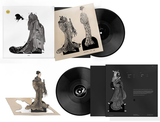
ARTWORK BY JASON TRAEGER – jasontraeger.com
LAYOUT & DESIGN BY MATT MAYER
“I’ve known Jason Traeger for several years now as a friend and collaborator in Oregon Painting Society, and I’ve long admired his playfully surreal, mystical oil paintings. When sequencing the tracks for All Moments, it became apparent [to me] that the mood and feel of these pieces was very different from my last LP, Particle Language, which had a kind of grey-void machine language vibe. These tracks were colorful dream worlds, playful and fun. Jason’s paintings were the first and only idea I had for the artwork. The paintings already existed, so no direction was given to him by me, but he has his own elaborate artistic philosophy and vision, which you can ask him about. Visuals are usually the last thing I think of with my work and I often have a hard time with it; I’ve usually just relied on artist friends of mine to take care of it for me.” – Matt Carlson
“There are little hints and clues that inform the design. Like if you look at the LP label on the side a song is on, the song title and the color palettes line up on the back cover of the LP. There are etched messages on each side of the vinyl.” – Michael Cina
ART DIRECTION BY MICHAEL CINA AND MATTHEW DEAR
ARTWORK & DESIGN BY MICHAEL GINA – cinaart.com
THEMATIC ELEMENTS
“The album artwork started with a 15-minute call between Matthew Dear and myself, and we just talked. In that short time, we came up with an idea that I was going to paint him live in NYC in front of a camera with things happening around us. That “Beams Story” video came from that conversation, and ultimately, the cover… I really thought about the album like form and colors after hearing the LP. I had a color palette picked out, and that is what ultimately lead the project for me. We knew there was four singles as well, so that was always present on how the project “unfolded” through each single. Matthew Dear was an important part of the process. I don’t know how to describe it, but we just had this understanding of what it was we were going for. He would offer comments here and there but he gave me space to do my thing. I think that is really the best way to direct a project, but both parties have to be on the same page.” – Michael Cina
ARTWORK BY WILLIAM SWEENEY – alakazamlabel.com
“There were no specific rules – their brief was very open and I got the sense that they wanted something vibrant and psychedelic, I showed them some old alchemical engravings which I wanted to base the composition on, and they seemed to like them. I also wanted to incorporate some Georges Méliès inspired moon people and give it a sort of lunar rave feel – I think Moon Duo’s music is very danceable and wanted to reflect that a bit. So it was a real mixture of things and a nice collaboration.” – William Sweeney
THE EXTRAS
“I had actually created an illustration for Moon Duo before, without them knowing it was me who did it, for a compilation LP called Menagerie. It was complete coincidence that they contacted me to do the art for Circles; I like to think that mysterious cosmic forces brought us together again.” – William Sweeney
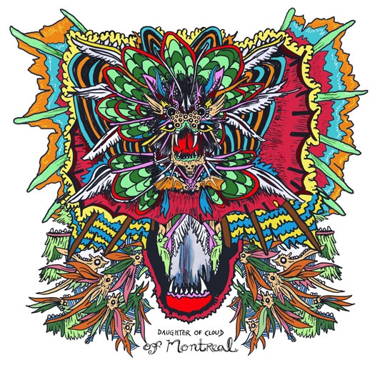
ARTWORK BY DAVID BARNES
DESIGN BY OPTIGRAM – optigram.net
ARTWORK BY MAKOTO AIDA – mizuma-art.co.jp
Artists could not be reached for comment.
ARTWORK BY RYO KURAMOTO – crooked-tapes.com
“Beau [Devereaux of Samantha Glass] had already had a great vision of this album. I hope I helped to visualize a part of his beauty.
All the stuff I drop [has] total DIY processes. Screen-printing, papercuts, and folding…. That’s why each artwork has different paper and ink. It’s kind of hard work for one guy [in a] small space, especially [since] Samantha Glass covers are massive. I made more than 500 copies. Each has 2 or 3 colors… maybe I’m trying to getting over DIY’s limitations.
Oh, and [I] always need tons of weed [during the] whole the process.” – Ryo Kuramoto

PART 1
PAINTINGS BY TURNER WILLIAMS – turnerwilliamsjr.com
“With Part 1, I had themes flying out my ass; one was this apocalyptic vision of a war-torn beachfront with this old lady rocking in a rocker as fireworks exploded overhead. So I had this very narrative idea for the art, which is why I contacted Turner, whose prints and paintings I loved and thought was capable of creating the details of these nuanced visions.” – Kathleen Baird
COLLABORATION
“Spires originally sent me 80 minutes of music. It was a really dense listening experience, and I started breaking the disc up into shorter albums… I got to know the tunes backwards and forwards after that year. Later, when they said they were going to release the music as two separate volumes, I wasn’t surprised. However, when they sent me the tracklistings, I was amazed to find their choices were really similar to mine! Maybe I tapped into some secret logic within those tunes from hanging out in Spires’ territory too long…” – Turner Williams
“It always starts with sending the artist the music. With Part 1, I started vomiting off all of these visions for Turner, giving him very detailed things to go off on…. we had many exchanges, a few missteps, and eventually we fell upon the bizarreness of Part 1. With Part 2, I decided that I didn’t want to give Turner any guidelines or directions; I wanted to give him complete artistic license without the paranoia of trying to please me — and that worked like a gem. I completely trust him.” – Kathleen Baird
ART DIRECTION & DESIGN BY MICHAEL GIRA OF SWANS
PAINTING & PHOTOGRAPHY BY SIMON HENWOOD – simonhenwood.com
(Editor’s note: There is an additional image that looks like an exploding fuzzy posterior.)

ARTWORK BY ROBERT BEATTY – remainsstreet.com
Artist unknown.
ARTWORK BY JON SANTOS – eyebleedink.blogspot.de
“A few of the cities on the backs of the Harmon creatures are Atlanta, Miami, Seattle which represent our homes (including Santos who lives in Seattle). The ice cream box packaging has a Rick Smith cone on the front. You can find little things that represent who we are on the sleeve.” – Steve Brooks of Torche
ARTWORK BY TATIANA KARTOMTEN – tatianakartomten.com
Artist was not contacted in time for commenting.
Related posts:
- 90 Notable Album Covers From 2010 : Part IV
- 2011 Year-End Respect For Album Cover Art: Illustration, Painting & Drawing
- Albums Of The Year 2011 : REDEFINE Staff Picks
music art film review - REDEFINE magazine
2012 Album Covers of the Year